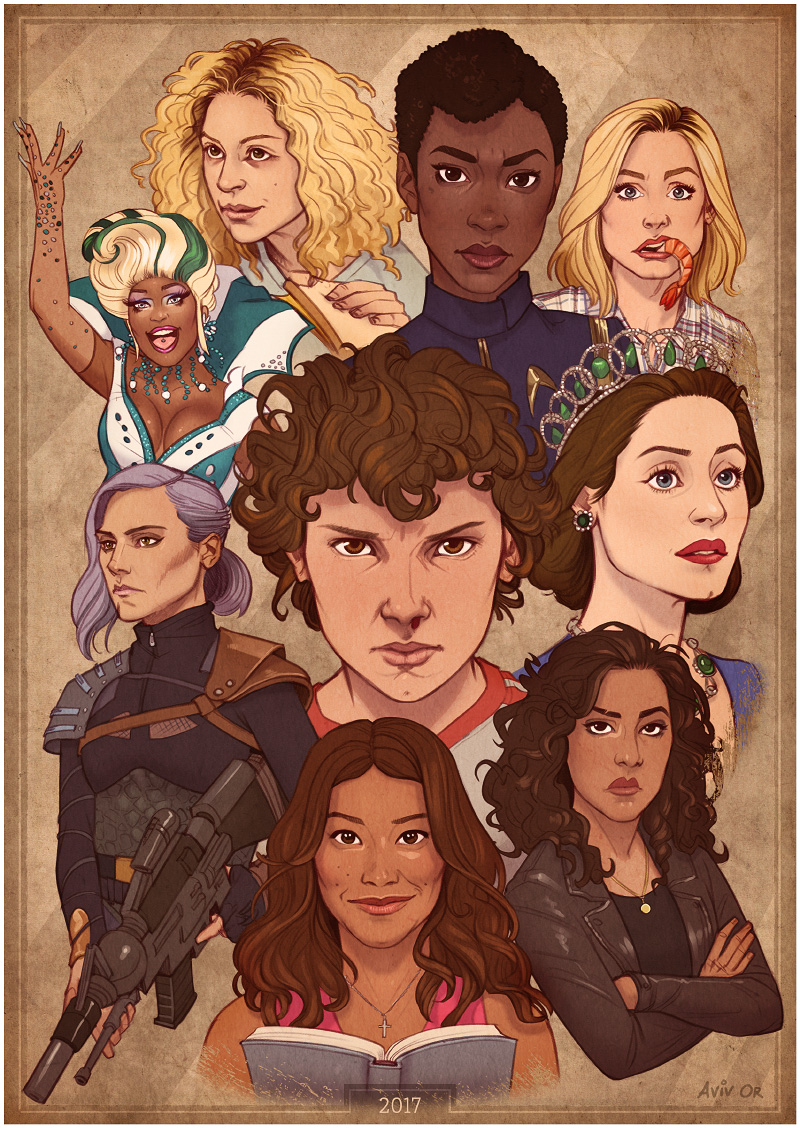
It was fantastic to see so many female characters on television this year, and an ever-growing number of female-led shows – really good ones, too! I think most of my current top favourite TV shows feature women leads. Drawing real-life people isn’t usually my thing, but all these awesome ladies made me want to push myself and give it a go.
First thing to do was compile a list of everyone I wanted to include. Some honourable mentions that didn’t make the cut include Rachel Brosnahan from the surprisingly entertaining The Marvelour Mrs. Maisel (who I sketched separately a few days earlier), Sansa from Game of Thrones, and Tulip from Preacher. I bet I missed a ton of others, because even though I watch a LOT of TV, I haven’t watched ALL of it. Yet.
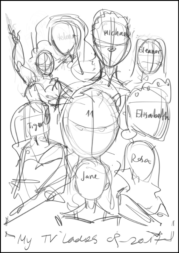
The next step was creating a rough composition, where the placement, size, direction, and in some cases pose of each character will be determined. As you can see, at this point it’s rough enough that I have to write down names even for myself.
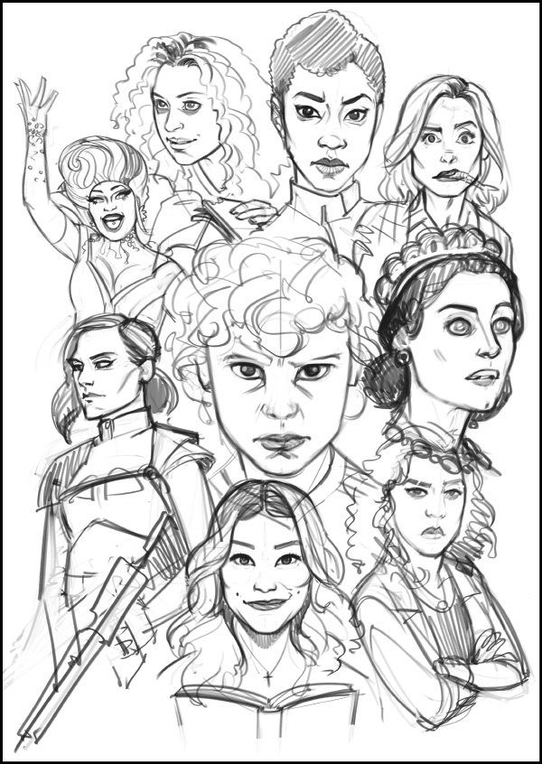
Then comes the part where I remind myself that drawing real-life people isn’t usually my thing and wonder what have I gotten myself into. But Queen Lilibet inspired me to go on; one must power through! The sketching phase is where I flesh out the character and define their expression – based on what I feel works for them, but also influenced by the reference images available.
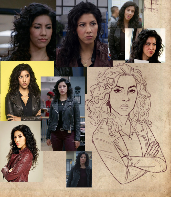
The next phase is refining the sketches with cleaner lines and working more closely with the visual reference, mostly for the likeness, but also for clothing and accessories. It looks a little like this while I work, except usually the photos are on the right side. It took me a good long while to work out it’ll be better if they were on the right because I kept hiding them with my left hand. Lefties can be very silly like that.
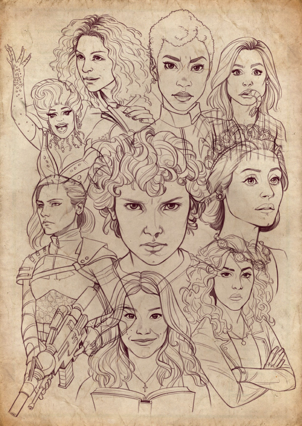
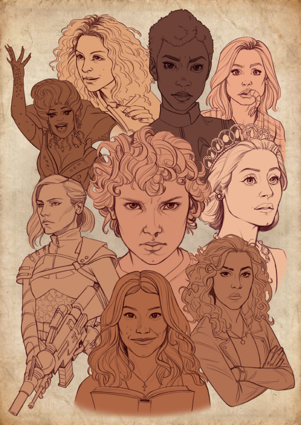
Here they all are, crisp and clean. Each one is on a separate layer so I can easily move them around if needed.
Moving on to colour, I create a base for each character (again, all separate layers) and make sure the different skin tones look right, on their own and in relation to one another. The reference photos had a huge range of tones due to lighting, so it was kind of a guessing-and-adjusting game.
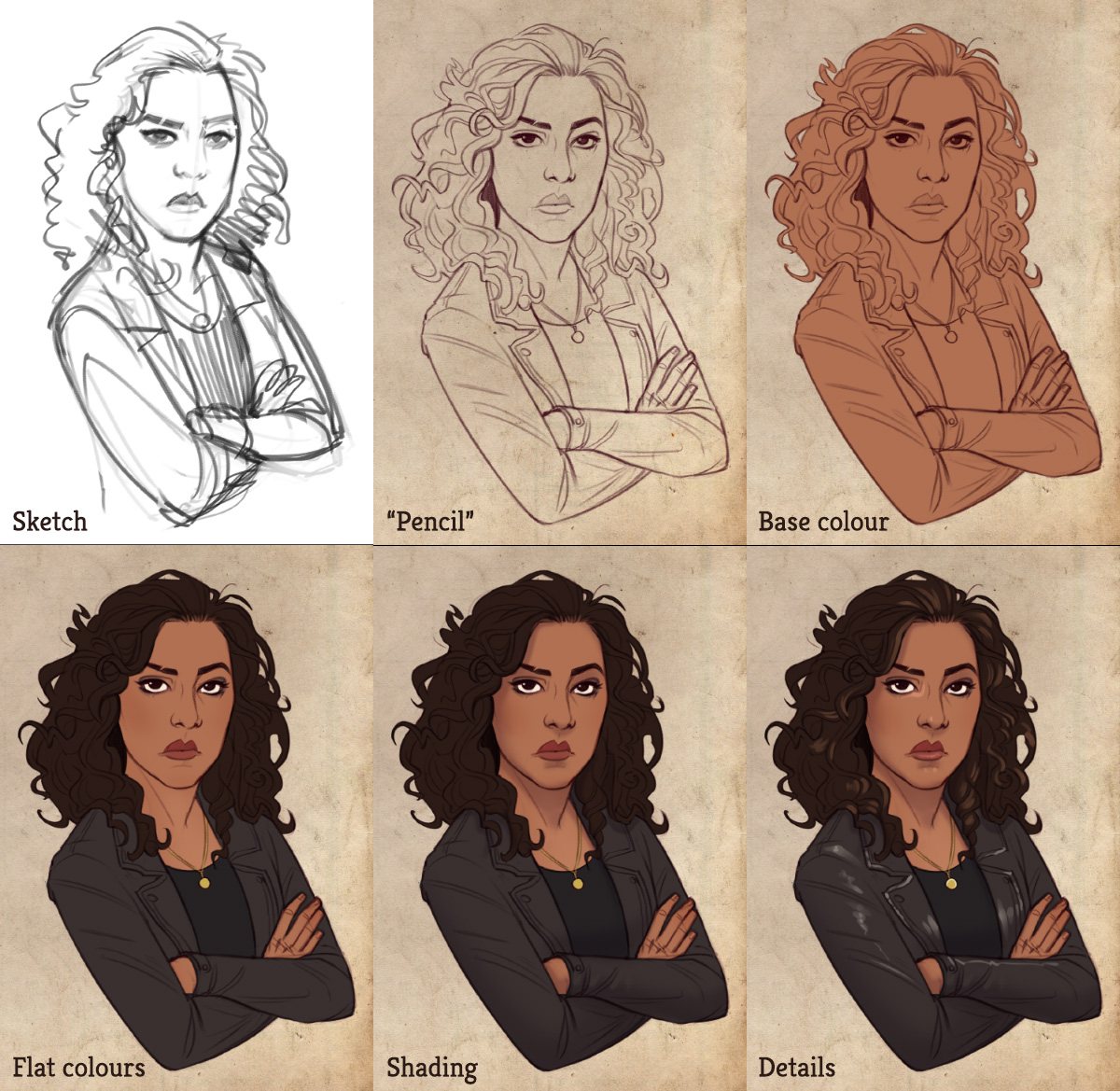
Stephanie Beatriz (Rosa from Brooklyn 99) was super duper awesome and shared my artwork on Twitter with some really lovely words, so I’ll spotlight her to show the process zoomed-in. The top row is the process so far. Then I add specific colours, using the same method shown here, of adding colour layers as clipping masks, so I don’t have to worry about “painting outside the lines” of the base colour layer I created earlier. Next I add some soft shading (basically just a purple layer set to Multiply, masked as needed). And the last bit is adding some details – small highlights, clothes/hair patterns etc.
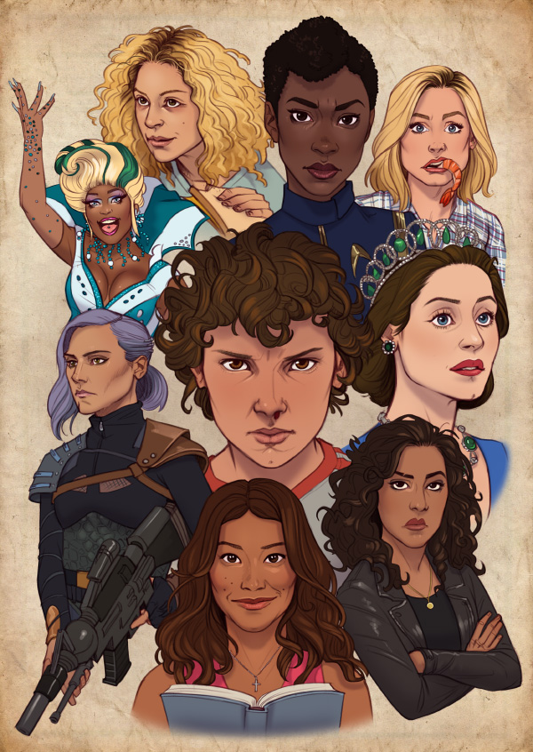
They all underwent the same process and came out the other side, looking colourful. Mmmm, too colourful.
Now comes the part I usually struggle with most when it comes to colour: taking all these individually painted or coloured elements – that work just fine on their own but kinda clash with one another – and combining them into a single cohesive piece. Thank goodness again for digital tools, I have no idea how I would even approach something like that in traditional media. But in Photoshop I try out various adjustment layers set to all kinds of layer modes until things look better. This time I also tried some actual filters, an area of Photoshop which I usually steer clear of, and they gave some interesting subtle effects (which might not even be visible in the end result, to be honest). Here’s the piece after some adjustments.
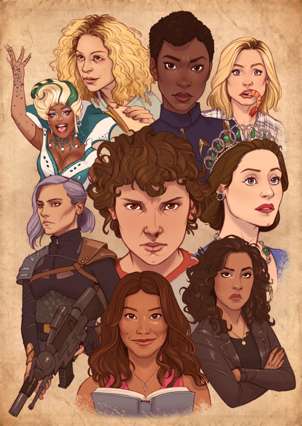
Add some flair to the background and some more graphic treatment to the border, and here’s the final piece, and what turned out to be my most shared artwork of 2017.
 Hebrew
Hi, I love this piece! It’s so amazing, and I saw it on Stefanie Beatriz’s twitter. Can I ask who the character is with the purple hair, holding a gun? I don’t quite recognize her. Thanks!