Archive for the ‘Process and Tips’ Category

Critical Role – A Day at the Festival

Tuesday, May 8th, 2018

I’ve been away from this blog for so long that I’ve never mentioned Critical Role here? Gosh golly.

Critical Role is a show in which “nerdy ass” voice actors play Dungeons & Dragons. It’s probably the most famous one in what is now a fairly popular genre of shows/podcasts called Actual Play – good old tabletop roleplaying games, recorded for an audience. Critical Role has been running for several years, but started a new campaign only a few months ago, with new characters going on fresh adventures; an excellent entry point to join the fun without watching hundreds of hours of the previous story.

I was excited for this campaign to start because I wanted to finally follow the story as it airs, and join the MASSIVE online community of amazing fan artists. This show inspires some gorgeous fanart, from hyper realistic landscapes to epic battle illustrations to silly comics. Every new episode spawns dozens if not hundreds of doodles, drawings and paintings, and IT. IS. AWESOME.

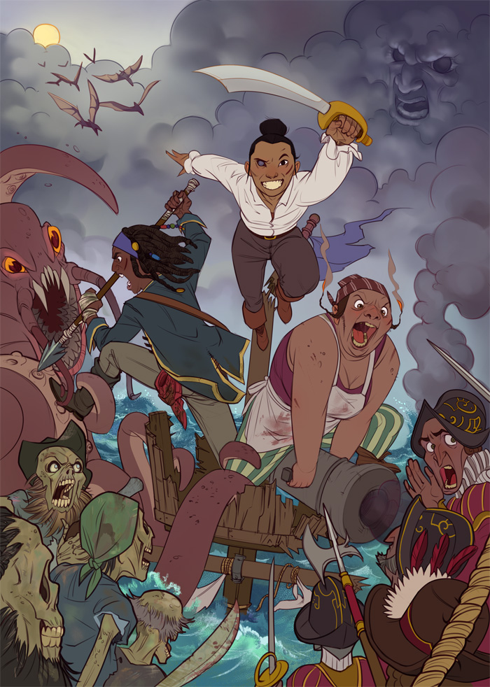
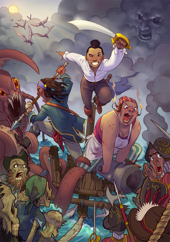
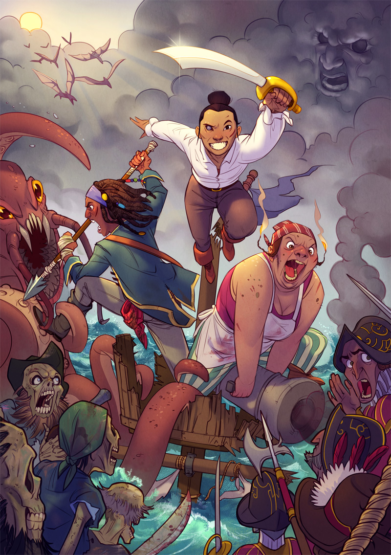
Critical Role - A Day at the Festival

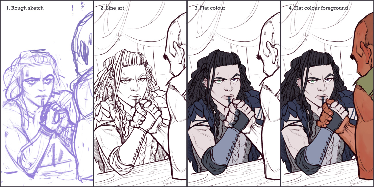
This piece was based on episode 17 , in which the party visits an autumn festival and some hilarities ensue. It was done on the iPad Pro using Procreate, and since I’ve never shown my process on an iPad here before (on account of the last blog update being before touch screens were invented, give or take), this looked like a good opportunity, even though it’s quite similar to how I work with Photoshop. Procreate is a really fantastic app for digital art on the iPad, tailored beautifully for touch gestures and the Apple pencil, and one of its nice features is the automatic video capture of the drawing process. Here’s Yasha the Barbarian to demonstrate things.

Breakup of the process

Yasha - process 1

1. Rough sketch

The video starts with an existing rough sketch, which I doodled in a different document along with the rest of the party and then dragged to a fresh, bigger canvas. Its purpose is to determine composition on the canvas, general pose and espression.

2. Line art

I’m still experimenting with Procreate’s brushes. It has a beautiful range of brushes that come with the app and so many options to tweak them and create new ones which I haven’t dared try yet. For this line art I used “Tara’s Vine Charcoal Sketch”, recommended to me by my friend and Procreate enthusiast Leda Chung. It has a nice sketchy feel, but with some smoothing to it. This stage is about refining the lines and working out the details. It’s where I have to make actual sense of the mess of lines forming the hands, for example, which is why you can see a reference photo magically appearing in the video (0:18).

3. Flat colour

With the line art done, I start colouring. The “flatting” stage is for filling areas with, well, flat colours – the basic colours for each area, before any shading, hue changes, gradients etc.

4. Flat colour foreground

It’s actually a bit more than just flats here – I already added some reddish and pale skin tones on the guy (see #6). They’re in separate layers just to make it easier to change things; if I could separate each and every element in the drawing without losing my place and my mind, I probably would.

Yasha - process 2

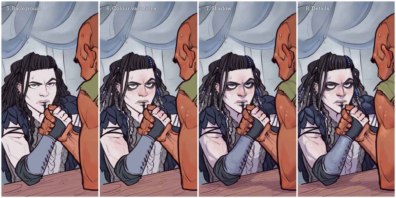
5. Background

I went with simple backgrounds for all the illustrations in this series, to give focus to the characters, and because I intended them to fit as mobile wallpapers, where one might want the top to stay clean for icons and stuff. Procreate brushes really came in handy here, helping to create a bit of texture and colour variation without too much effort.

6. Colour variations

Moving back to the characters, I used some textured brushes for their colour touches as well. This is the stage where I add any colours “on top” of the flat one: redness in the face and extremities; makeup; gradients and patterns in hair and clothes etc.

7. Shadow

Just like I do in Photoshop, I add a layer set as Multiply on top of everything, and colour in shadows with a purplish colours.

8. Details

A few final touches in a new layer, for last little highlights, fixes and touches of texture.

Doneso.

You can get all the illustrations as phone wallpapers in the original Twitter thread.


Cheers (and, is it Thursday yet?),

Aviv

Share

TV Ladies of 2017 – process

Friday, January 5th, 2018

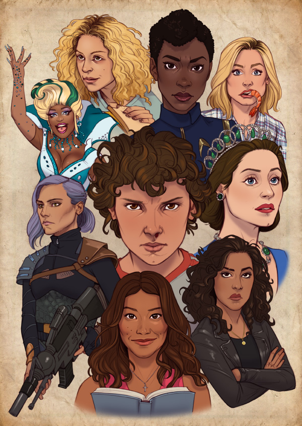
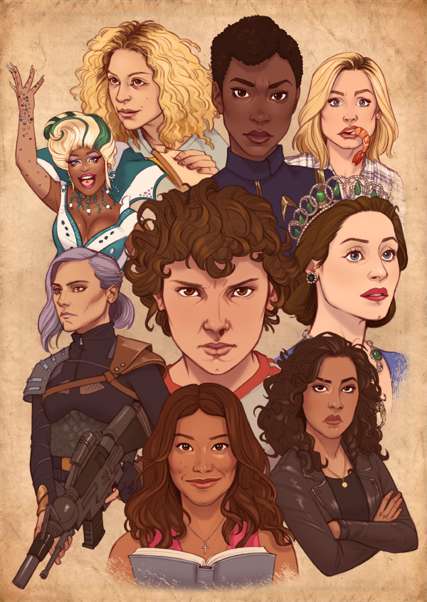
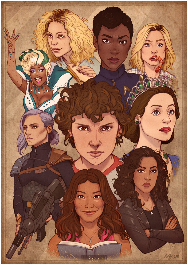
It was fantastic to see so many female characters on television this year, and an ever-growing number of female-led shows – really good ones, too! I think most of my current top favourite TV shows feature women leads. Drawing real-life people isn’t usually my thing, but all these awesome ladies made me want to push myself and give it a go.

First thing to do was compile a list of everyone I wanted to include. Some honourable mentions that didn’t make the cut include Rachel Brosnahan from the surprisingly entertaining The Marvelour Mrs. Maisel (who I sketched separately a few days earlier), Sansa from Game of Thrones, and Tulip from Preacher. I bet I missed a ton of others, because even though I watch a LOT of TV, I haven’t watched ALL of it. Yet.

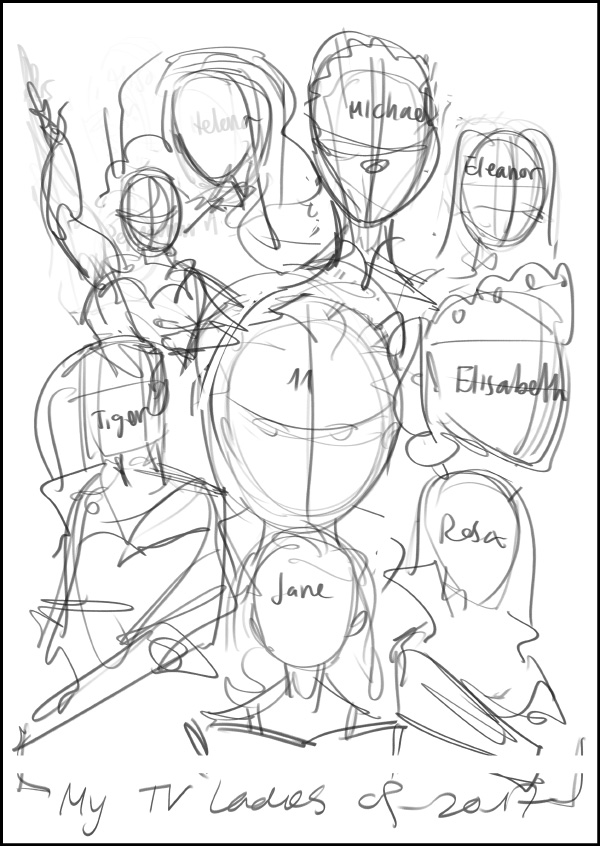
The next step was creating a rough composition, where the placement, size, direction, and in some cases pose of each character will be determined. As you can see, at this point it’s rough enough that I have to write down names even for myself.

TV Ladies 2017 - layout

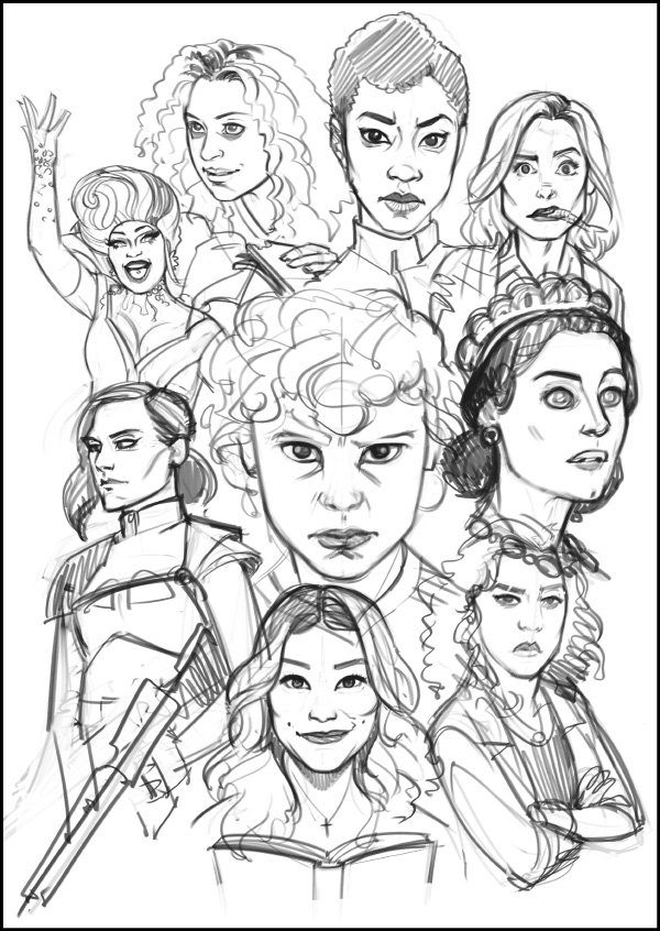
Then comes the part where I remind myself that drawing real-life people isn’t usually my thing and wonder what have I gotten myself into. But Queen Lilibet inspired me to go on; one must power through! The sketching phase is where I flesh out the character and define their expression – based on what I feel works for them, but also influenced by the reference images available.

TV Ladies 2017 - sketch

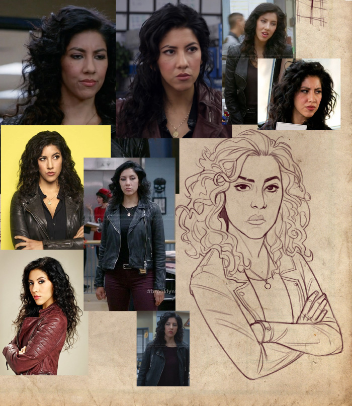
The next phase is refining the sketches with cleaner lines and working more closely with the visual reference, mostly for the likeness, but also for clothing and accessories. It looks a little like this while I work, except usually the photos are on the right side. It took me a good long while to work out it’ll be better if they were on the right because I kept hiding them with my left hand. Lefties can be very silly like that.

TV Ladies 2017 - references

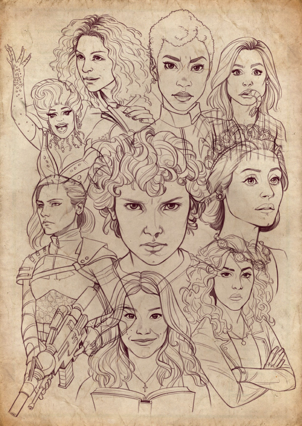
Here they all are, crisp and clean. Each one is on a separate layer so I can easily move them around if needed.

TV Ladies 2017 - pencil

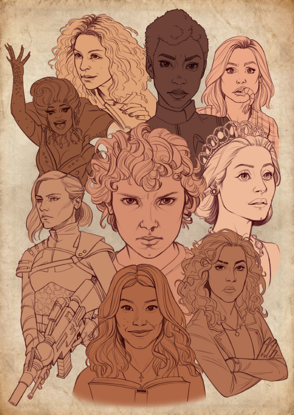
Moving on to colour, I create a base for each character (again, all separate layers) and make sure the different skin tones look right, on their own and in relation to one another. The reference photos had a huge range of tones due to lighting, so it was kind of a guessing-and-adjusting game.

TV Ladies 2017 - base colour

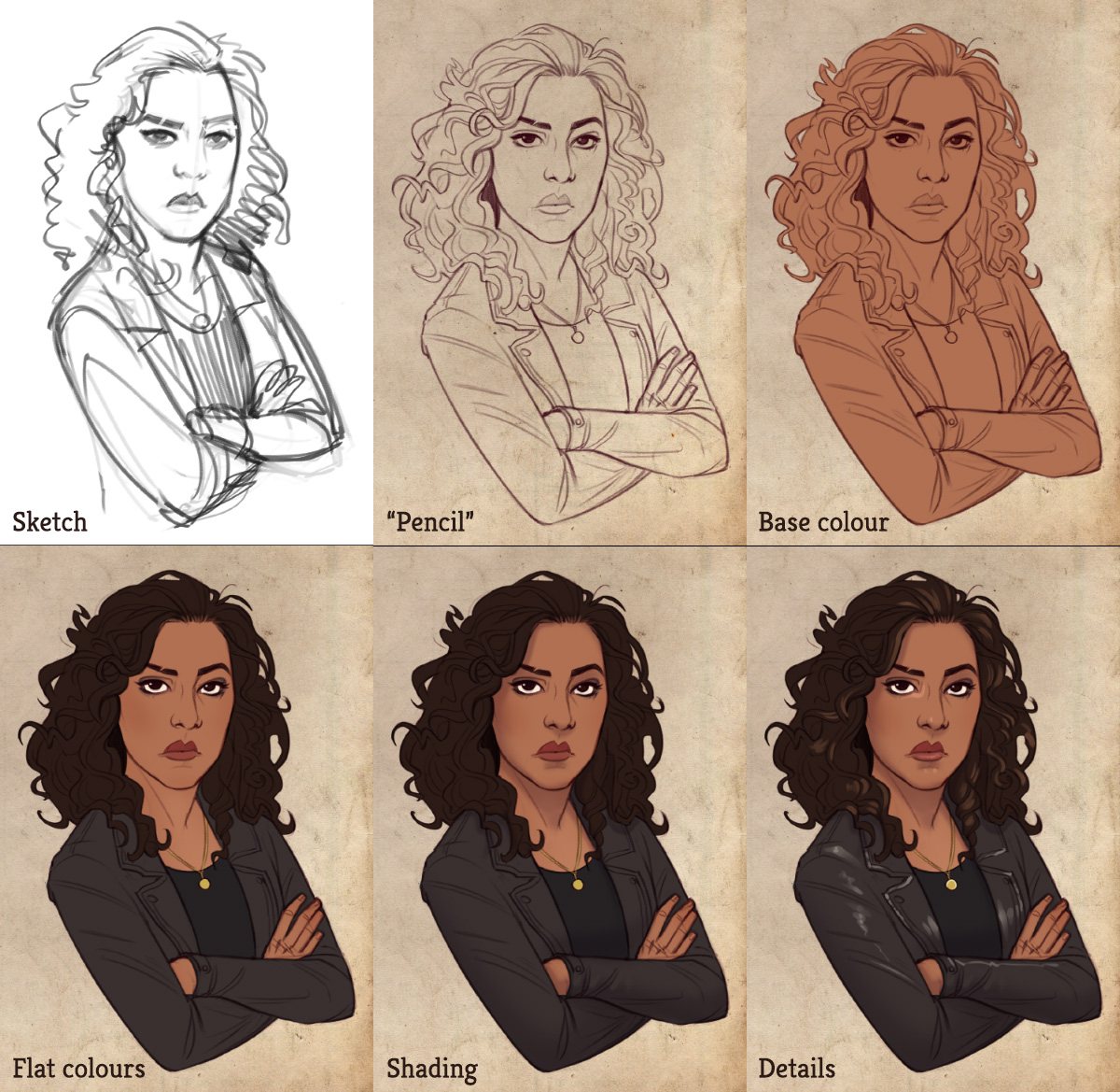
Stephanie Beatriz (Rosa from Brooklyn 99) was super duper awesome and shared my artwork on Twitter with some really lovely words, so I’ll spotlight her to show the process zoomed-in. The top row is the process so far. Then I add specific colours, using the same method shown here, of adding colour layers as clipping masks, so I don’t have to worry about “painting outside the lines” of the base colour layer I created earlier. Next I add some soft shading (basically just a purple layer set to Multiply, masked as needed). And the last bit is adding some details – small highlights, clothes/hair patterns etc.

TV Ladies 2017 - colour process

They all underwent the same process and came out the other side, looking colourful. Mmmm, too colourful.

TV Ladies 2017 - colour

Now comes the part I usually struggle with most when it comes to colour: taking all these individually painted or coloured elements – that work just fine on their own but kinda clash with one another – and combining them into a single cohesive piece. Thank goodness again for digital tools, I have no idea how I would even approach something like that in traditional media. But in Photoshop I try out various adjustment layers set to all kinds of layer modes until things look better. This time I also tried some actual filters, an area of Photoshop which I usually steer clear of, and they gave some interesting subtle effects (which might not even be visible in the end result, to be honest). Here’s the piece after some adjustments.

TV Ladies 2017 - adjustments

Add some flair to the background and some more graphic treatment to the border, and here’s the final piece, and what turned out to be my most shared artwork of 2017.

TV Ladies 2017 - final

Share

Cutlasses without Captains

Monday, September 25th, 2017

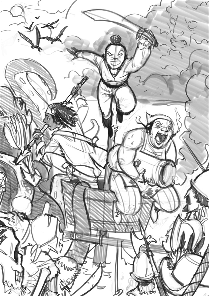
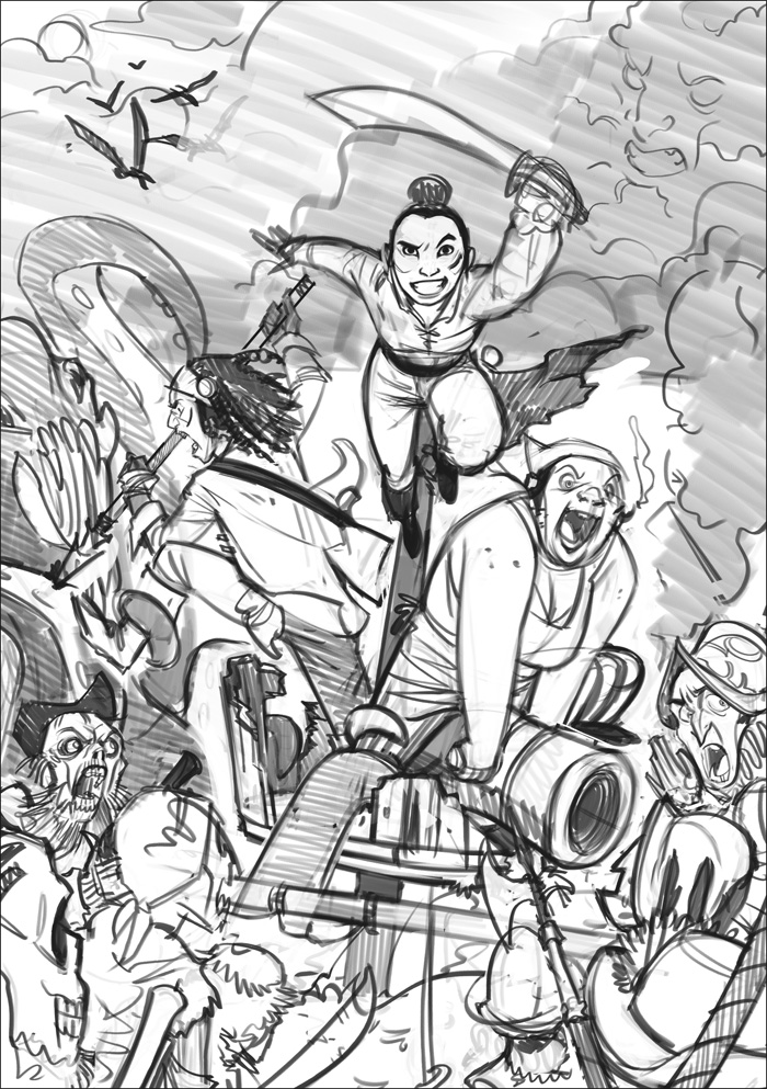
Another Richard commission! My third project for Richard should have been a cover for a game that already had some character design done by someone else. It still sounded like a fun project, but then Richard said “actually, let’s do an illustration for a pirate game instead”, and I was ON BOARD and (wo)manning the cannons.

As usual, Richard provided wonderfully detailed specs and references, which led to this not-quite-rough sketch.
Cutlasses Sketch

After some notes, we were happy with this:
Cutlasses Sketch

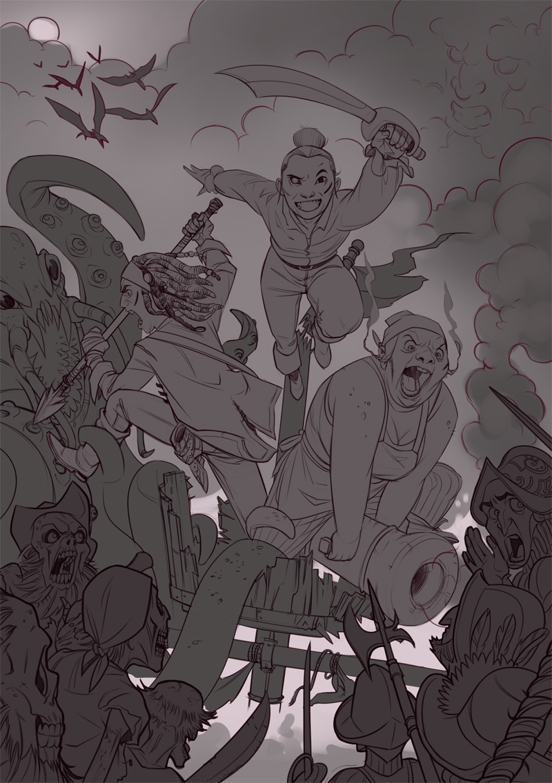
And I moved one to cleaning the lineart and fine-tuning the details. The greys here are just to separate the different planes of the drawing for easy (albeit super dark for some reason) viewing before colour.
Cutlasses lineart

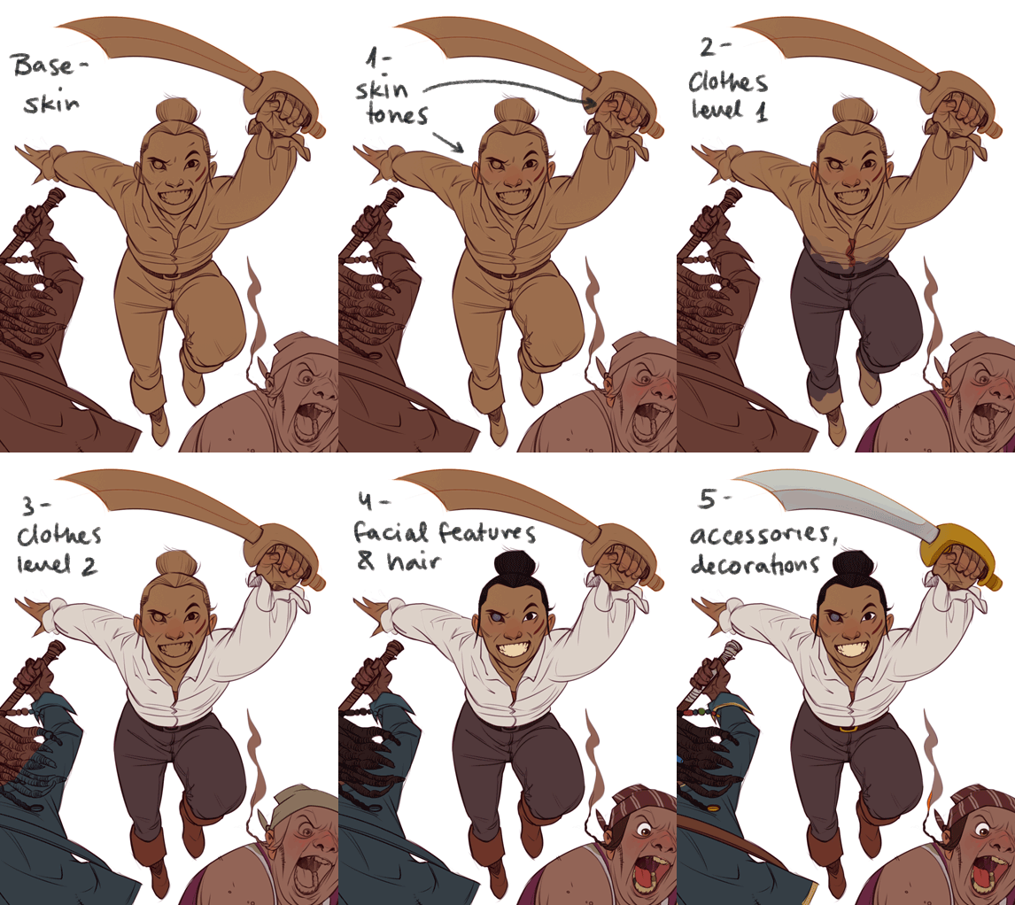
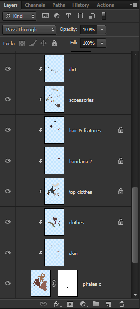
For laying down colour, I used the layers that had I already separated as base, and added the different colours as clipping masks – meaning that whatever I painted on them would only show within the bounds of the base layer. Here’s what it looks like:

This is more or less what it looks like after this stage (although the background has already been treated here):
Cutlasses flat colour

The next step is light and shadow, which I add either with Adjustment Layers (Levels, Curves, or any other mysterious tone-adjusting controls I happen to stumble upon) or Solid Colour layers set to Multiply for shadow and Overlay for light. These special layers are also clipped to the base layer, on top of all the different colours.
Cutlasses colour

And this is the point where I usually stare at the piece and wonder why I don’t like it. Often it’s because I’ve been working on it for hours and have lost all sense of judgement, but sometimes some adjustments to colour and contrast and a few small details can make the illustration pop a little more. I wish I was better at this stage, of knowing what needs to be done to make it GOOD, and when is it okay to say enough.

Here’s the final piece, which Richard was happy with. And so am I! It feels piratey. Richard posts updates about Cutlasses without Captains here, check it out.
Cutlasses without Captains

Share

Teen Detective

Wednesday, July 26th, 2017

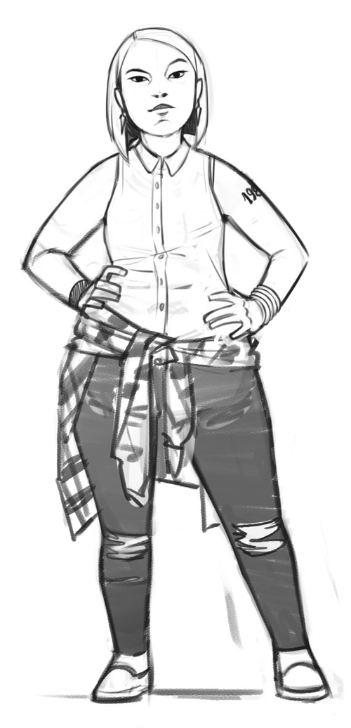
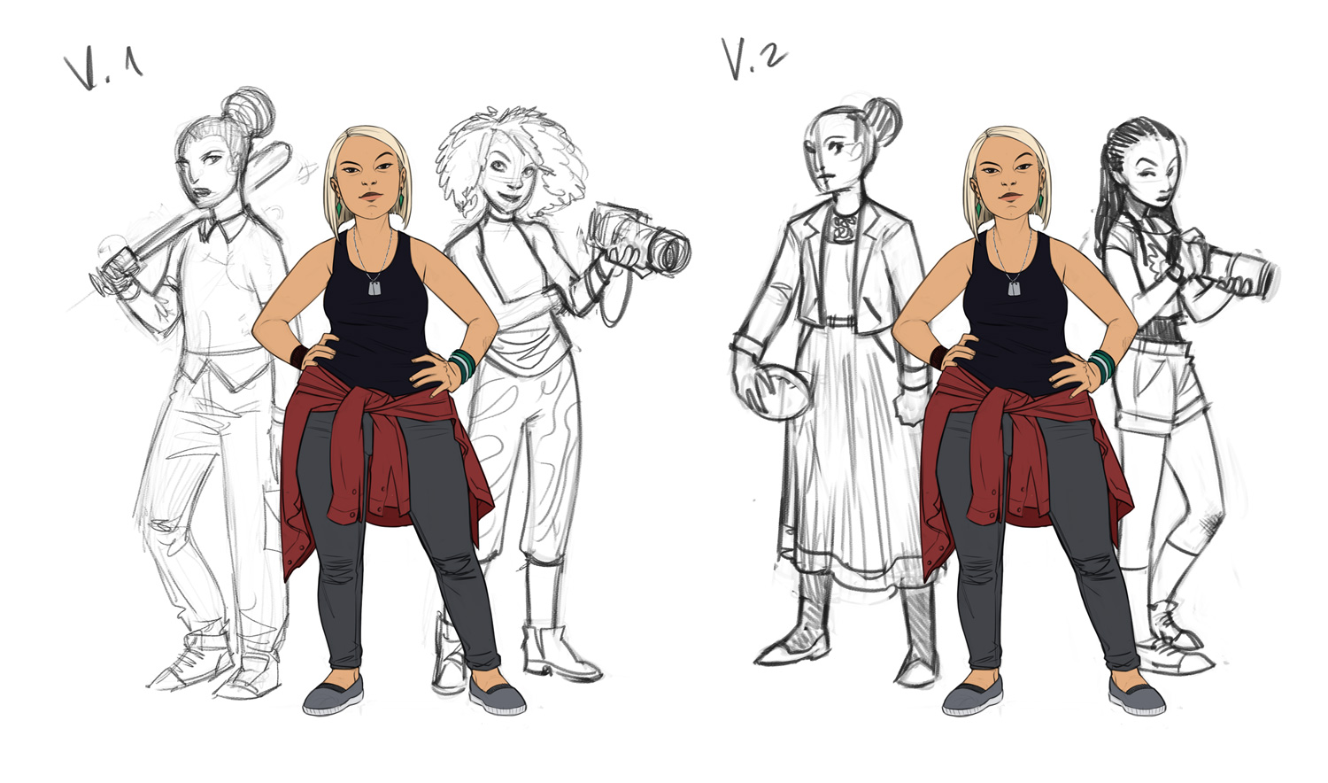
Here’s another commission from Richard Williams, this time for his Veronica Mars inspired C’thulhu Dark hack “Teen Detective”, which you can read about as it progresses here. He requested an illustration of three teenage girl detectives of varying ethnicities, body types and personalities, in a composition with one main lady in the front and two supporters to her sides. The style he was after was like my Bad Bones Lawrence character design.

Tip for commissioning artwork: adding a reference image that shows the style you’re looking for – lines, colour, cartoon/realism, flat/3D, level of detail – is really helpful. It means the artist knows what they’re aiming for, and the client knows they’ll get a result close to what’s in their mind’s eye. Picking a reference image out of the artist’s portfolio is even better, because it shows that a) you’ve looked at the artist’s body of work and chose them specifically; and b) the artist has worked in that style in the past, so it’s in their creative “arsenal”.

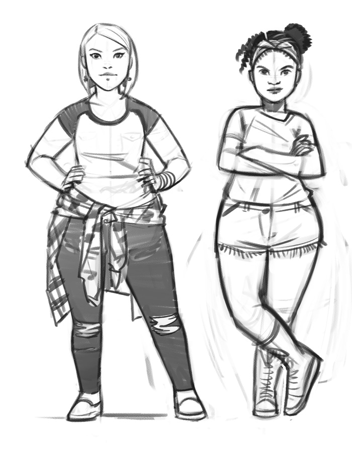
Richard also wanted each character as a separate image, so we started with Main Girl (naming not being our strong suit at this point). First I sent Richard two options for her design and pose:
Teen Detective: Main - concepts

He picked the left one, and asked that I make her convey “the cynicism of the private eye, the sense that she can read your guilt on your face, and her status as an outsider”, as well as give her sliiiightly more asian features to make her look more mixed race.
Teen Detective: Main - sketch

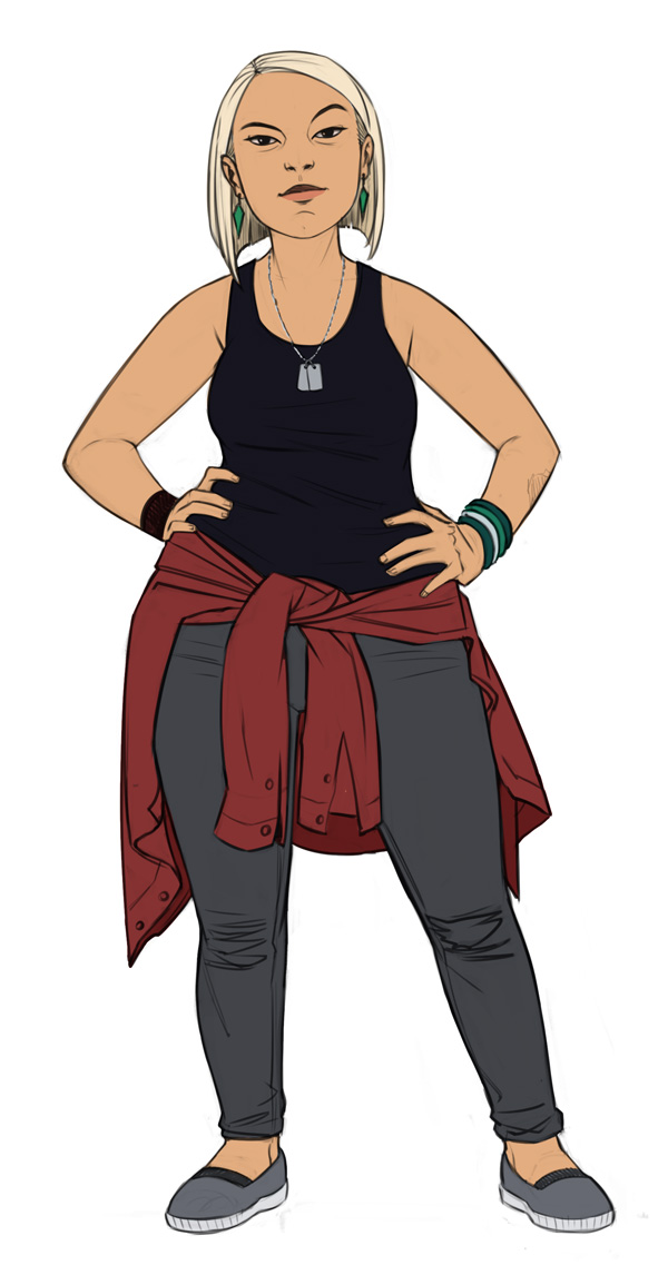
After a couple more adjustment to her outfit, I sent a rough colour version to make sure we’re on the same page before I move on to the long process of painting.
Teen Detective: Main - rough colour

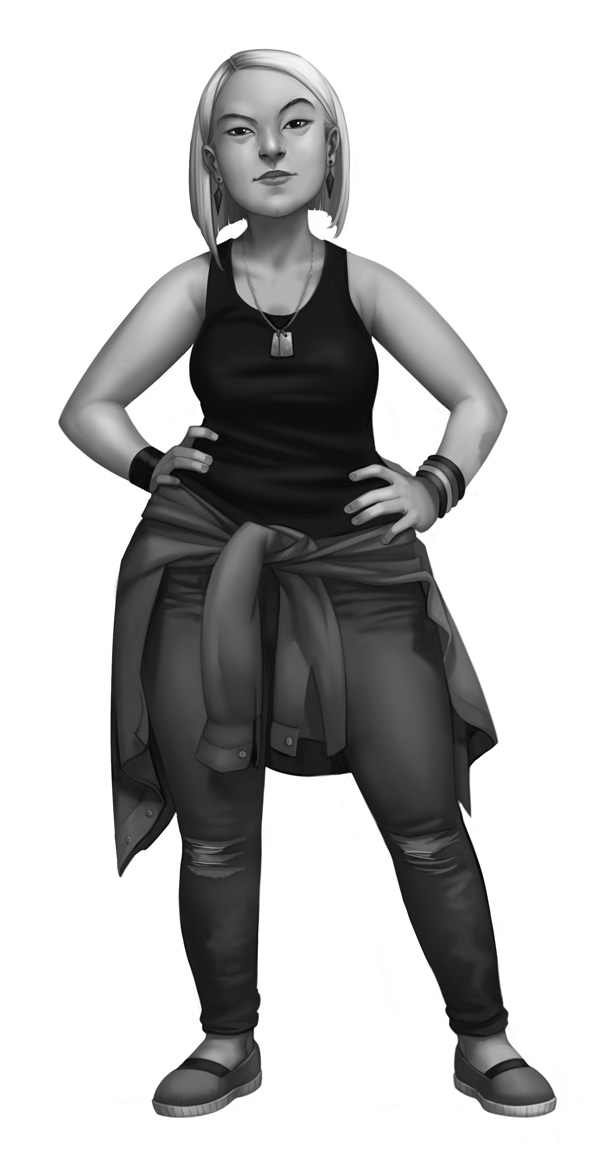
Colour doesn’t come naturally to me, so I prefer to start rendering in black and white to get the tones and shapes right, and only then apply colour. Here’s the black and white version, which I also sent to Richard to make sure I didn’t veer off the original sketch too much, which can often happen with painting.
Teen Detective: Main - black and white

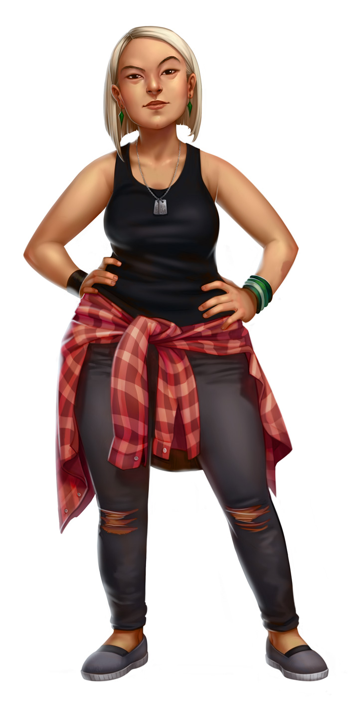
And lastly, the final colour render, with all the details and patterns and stuff.
Teen Detective: Main - final colour

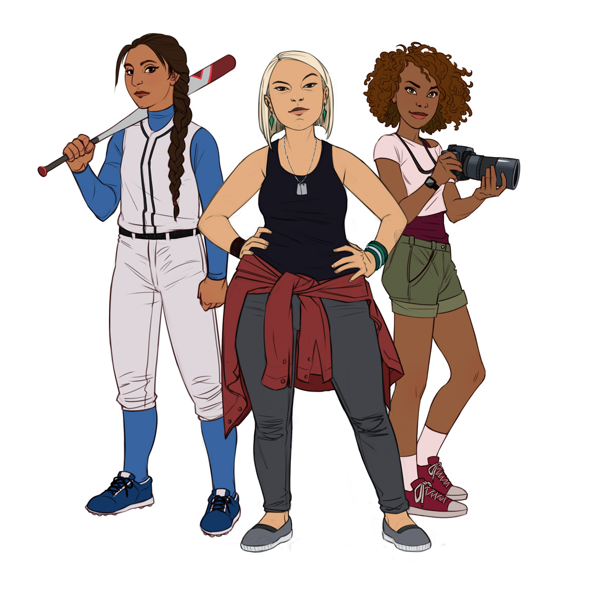
It was a good call to go through the whole process with just one girl first, because after looking at everything, Richard found the rough colour version appealing in its cleanliness and simplicity, and asked for the other two girls to be in that style. If needed, we could always pick up from that point and go the full painting route in the future.

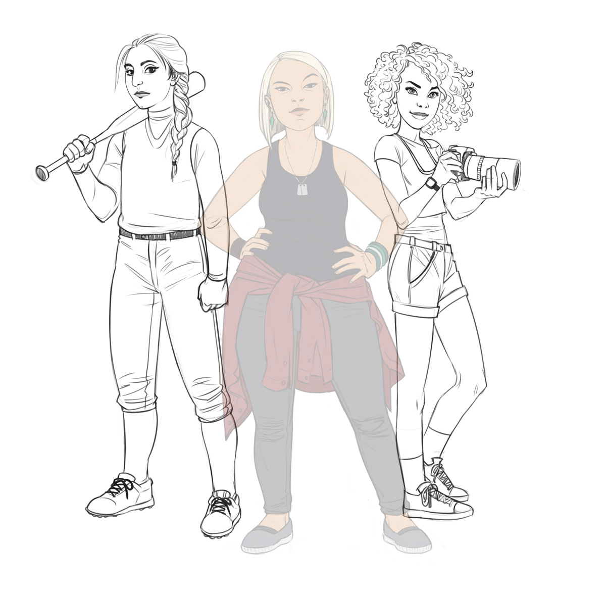
So for the other two girls (named “Snoop” and “Tough” for work process purposes) we went through the same steps, starting with two quick options each.
Teen Detective: Girls - concepts

A little mix-and-match and some outfit comments later, here’s the clean pencil artwork for the two girls:
Teen Detective: Girls - pencil

And finally, the finished illustration in flat colour:
Teen Detective: Girls - colour

You can see Richard’s progress in the game’s Google Plus collection page. I’m looking forward to being a cool teenage detective when the game is fleshed out!

Aviv

Share

Space party, table of seven!

Wednesday, July 12th, 2017

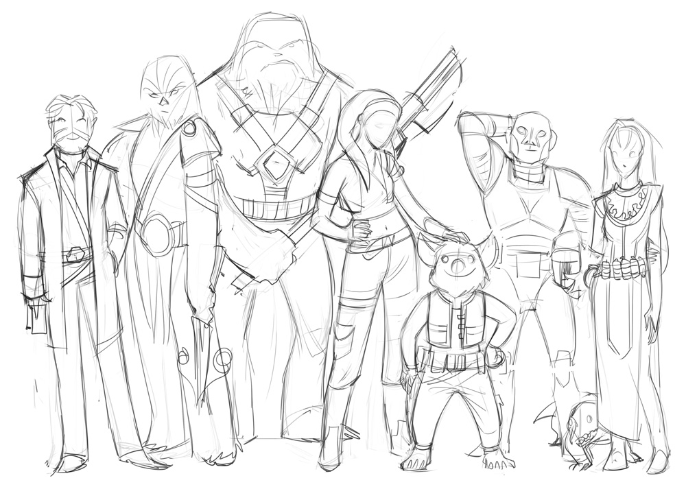
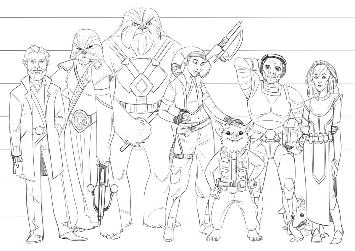
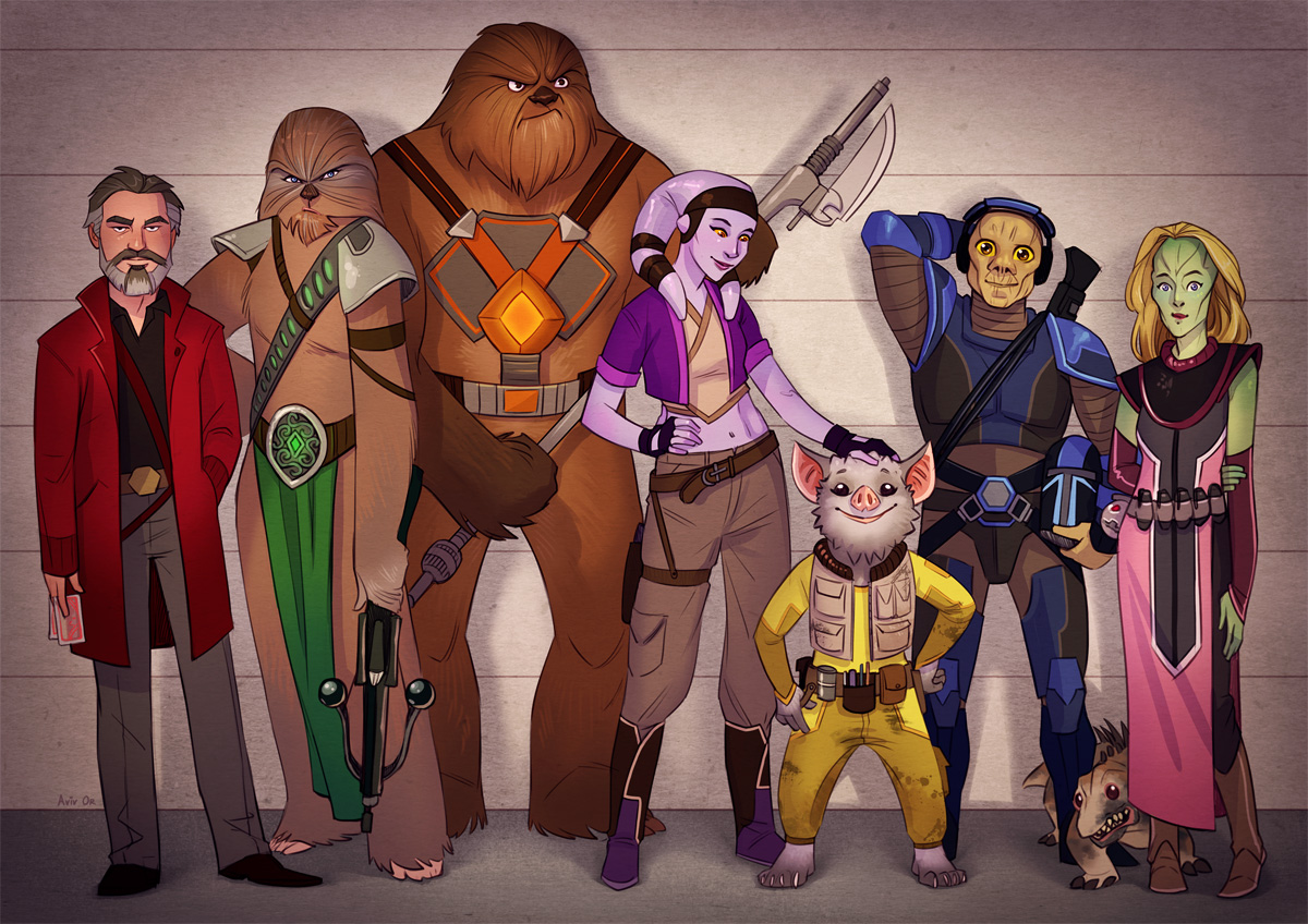
I was recently commissioned by James, an Edge of the Empire GM, to draw his campaign’s party. He runs a game for his two friends and their five children, which is so cool. How does the saying go, a family that harnesses the light side together, stays together?

He sent me descriptions of all of their characters, along with helpful links (because I warned him in advance my Star Wars knowledge is limited to what I’ve learned from the Bacta Basics segments on the Campaign podcast), and we agreed on a police lineup type poster, because they’re a bunch of scoundrels (and I’ve literally *just now* learned that Timothy Zahn’s book “Scoundrels” features the same image style on its cover. So…force-sensitive minds think alike, I guess?).

Here’s the layout I created to make sure I got the body shapes, heights and poses right, and – following James’s approval, the clean sketch.

Edge of the Empire party: layout sketch

Edge of the Empire party: pencil

For colour, James mentioned his friends’ family had a system where each member has their own colour for stuff – water bottles, backpacks etc – so they know what belongs to whom (apparently that’s helpful in a family of seven people). I loved that idea – both for real life and for the poster – and tried to incorporate each person’s colour in a clear, but subtle enough way.

This is what we ended up with, which I hope the party likes! You can read their adventures on their Obsidian Portal adventure log: http://deathfrombelow.obsidianportal.com/adventure-log

Edge of the Empire party: colour

May the Force be forever in your favour!

Aviv

Share

Geek Road: Poster and Process

Saturday, October 19th, 2013

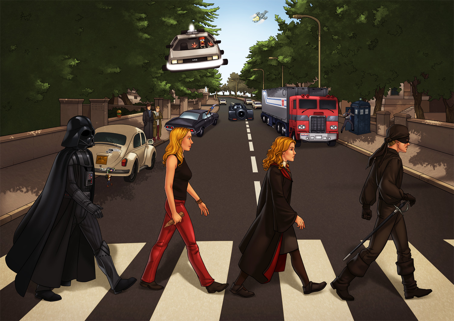
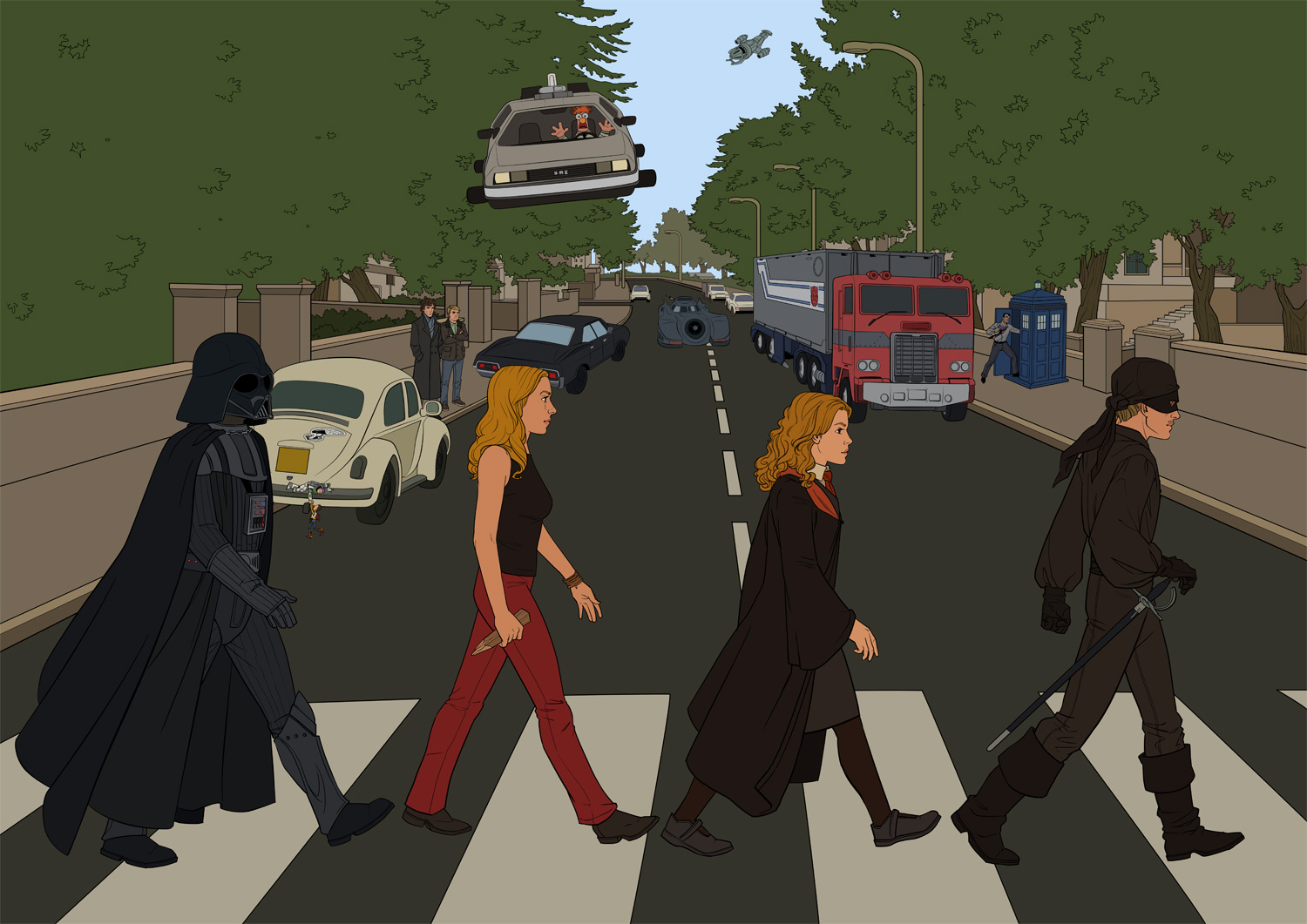
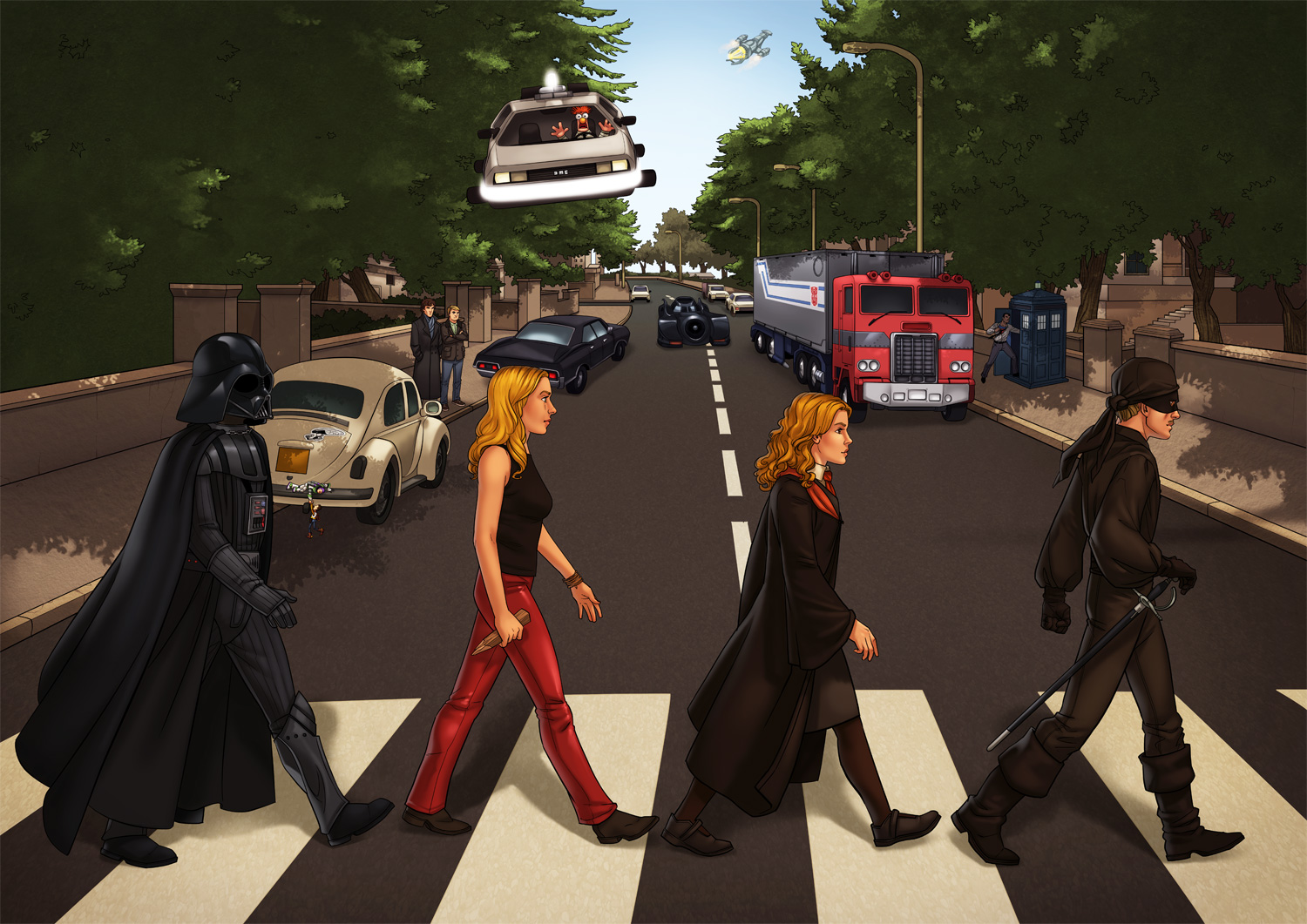
A couple of friends wanted me to illustrate a poster for them, and their request was so detailed and rich with cool geek stuff that I had to take the job or the universe would have imploded around me. So, with Idan and Danielle’s permission, here’s the final piece, and right after it a break-down of the work process:

Geek Road - Final

Clarifications and disclaimers: The original CD cover is the design of Apple Records’ creative director based on a sketch by Paul McCartney (apparently); the idea and choice of all elements are the brainchild of Idan and Danielle; all the characters, vehicles, aircrafts, weapons, puppets and police phone boxes that are actually time machines belong to the owners of their respective intellectual properties. If you post an image from this post somewhere else, I’d appreciate it if you linked back here. Thanks!

Work Process

00 – The request

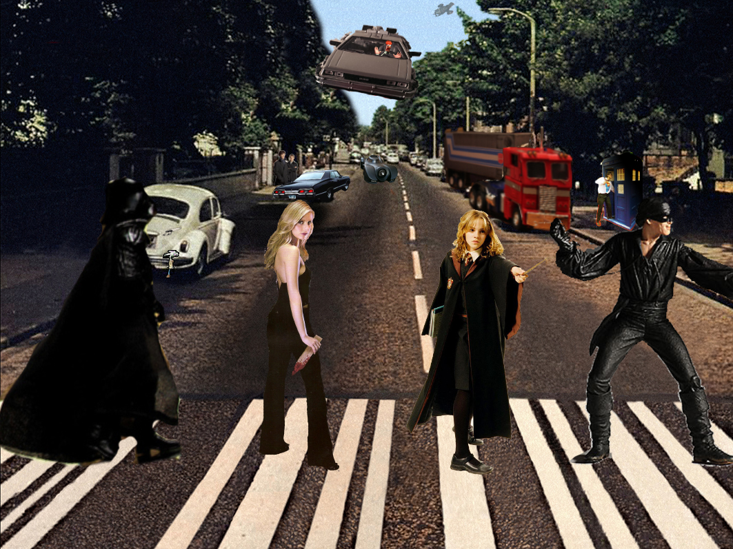
Idan and Danielle’s idea was to illustrate The Beatles’ Abbey Road cover, with the Beatles replaced by characters from their favorite fandoms, and the background filled with elements from TV, movies and video games. I wish every job request I ever got was so meticulous: Idan and Danielle knew exactly what they wanted, thought about all the details in advance and sent me a full list with reference photos they shot themselves and a mockup they put together in Photoshop to convey their ideas. After a few short questions I could get right to work.

Geek Road - mockup

01 – Pencil

Since the composition was already done, I could skip the initial sketching phase and move on to pencilling all the different elements into one scene. I work directly on the computer, so the “pencil” is a fun brush that comes with more recent versions of Photoshop, that responds not only to Wacom pen pressure but also to its angle.

Geek Road - pencils

02 – Ink

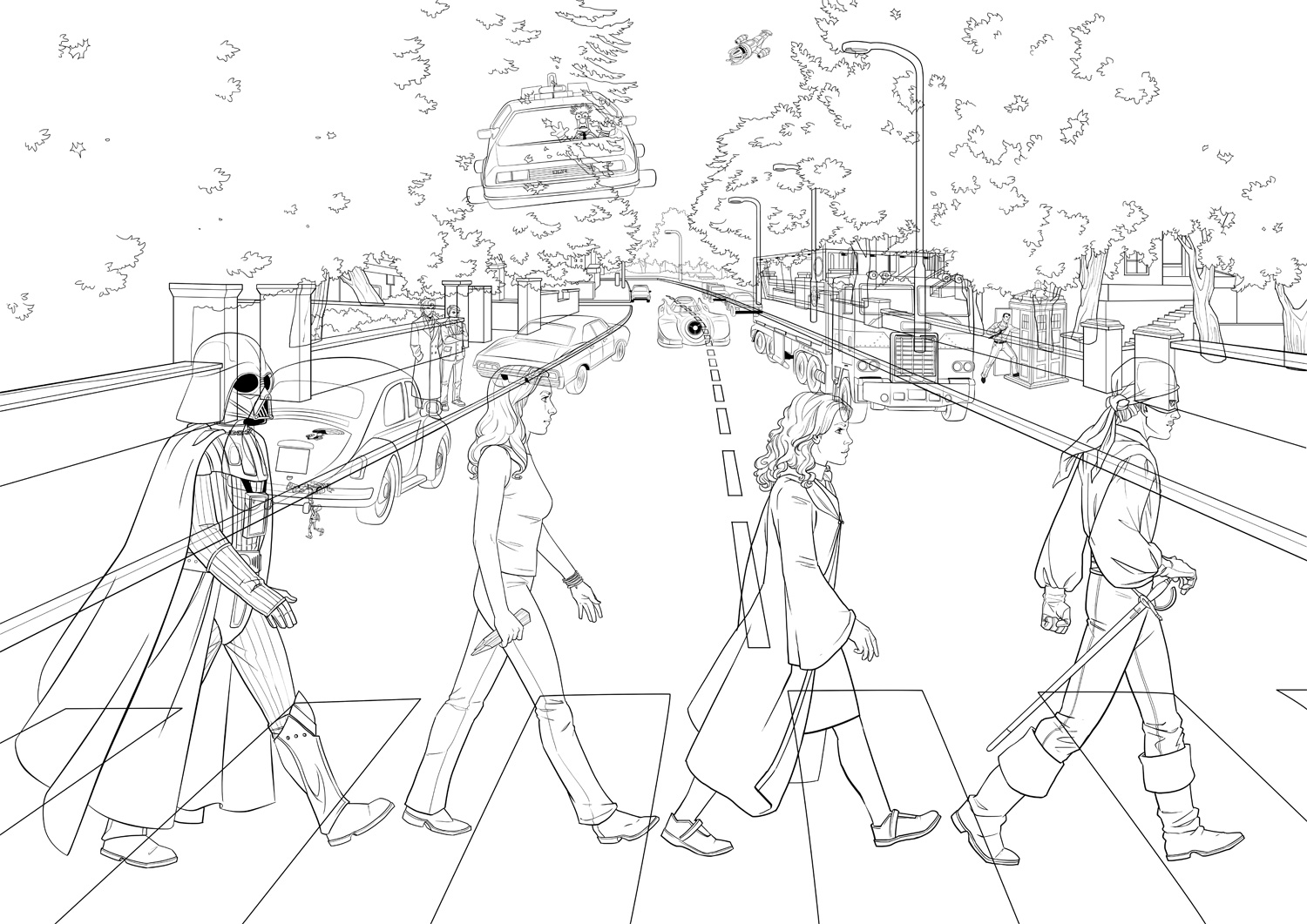
I wrote a long post about digital inking in Hebrew if you read it (might translate that bad boy one day). In this piece I used mostly Photoshop’s vector tools. Since the poster would be printed big, I wanted to avoid slightly shaky lines that are more likely to happen in freehand inking: they may be negligible on screen, but they won’t be pretty in print. Working with the vector pen tool allowed me to control the curve of each path, and when I was happy with it, the “Stroke Path” feature easily creates a bitmap “ink” line that follows that curve. It was useful mostly for the all technical vehicles and the flowy fabrics; for faces, hands and other small details I inked freehand.
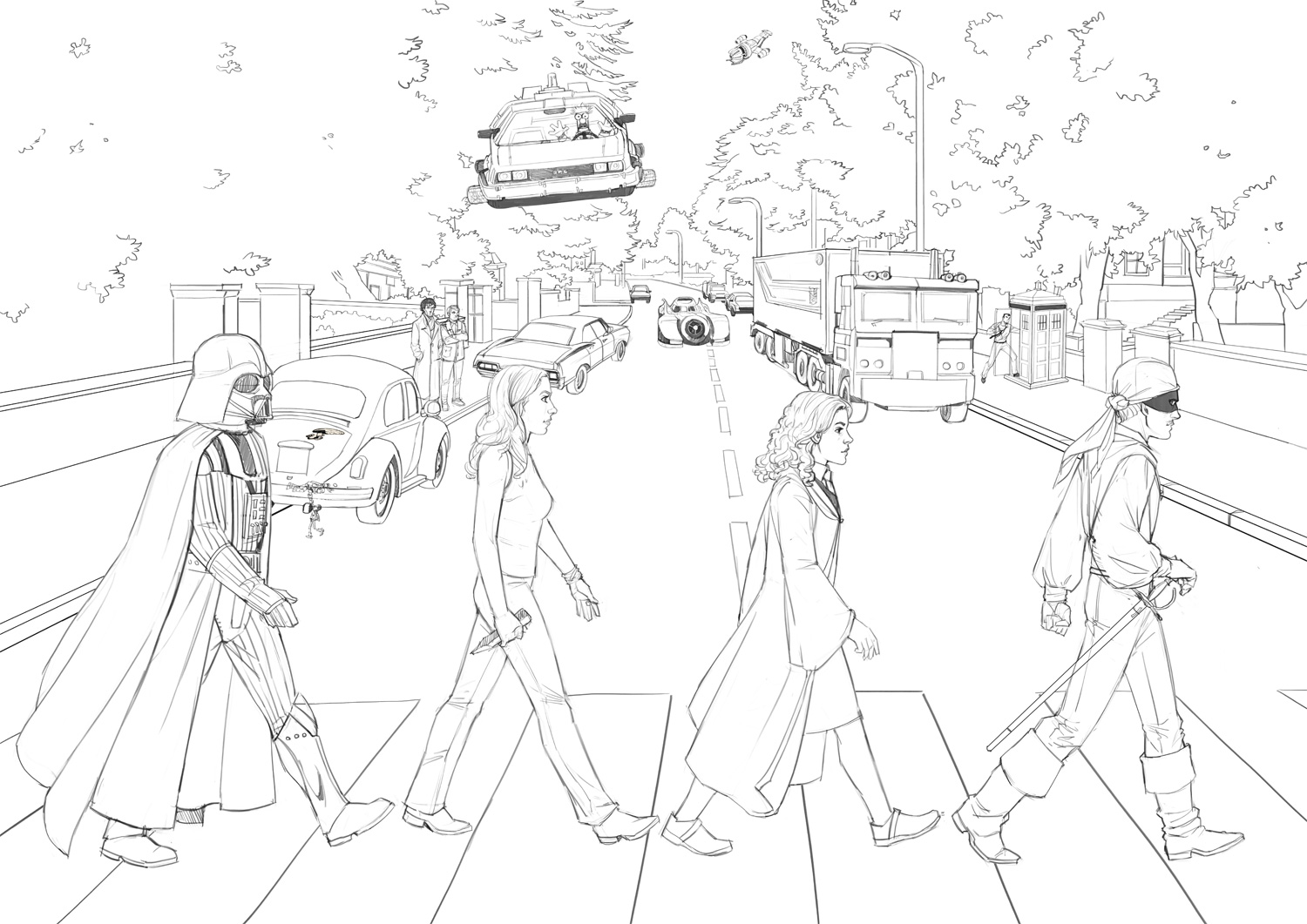
This is how all the inked layers look together:
Geek Road - ink
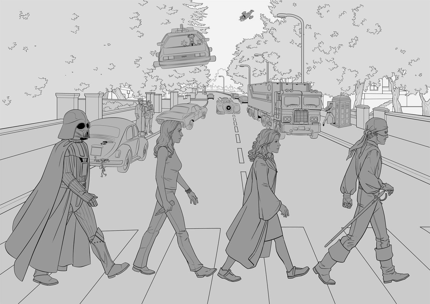
But to show Idan and Danielle I added basic flat colors so they could tell what was going on. Almost every element in the illustration is on its own layers, so I could easily move and transform things. Oh, Photoshop – my heart is forever yours.
Geek Road - ink separated

03 – Basic Colors

Also called “flatting” – under the lineart layer I block in flat colors as base for adding lighting and shadows.
Geek Road - flats

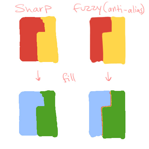
There’s not much to say about this phase, except that I recommend doing it with tools with sharp pixel edges: use the pencil instead of the brush, and removing the “anti-alias” check from the fill bucket and selection tools. It’s much easier when you want to select or fill already-colored areas, and this shows why:
Don't color with anti-alias

04 – coloring
There are dozens of color techniques and dozens of way to achieve each of them in Photoshop. This is just one, that I found pretty efficient: it uses Adjustment Layers to get light and shade quickly, and more important – to change things later if necessary. Adjustment Layers are great because they let you play with a layer’s color and tone in a reversible way, and since they always have a mask attached to them, you can show or hide as much of the adjustment as needed. I separated one character to show the process:

Geek Road - coloring process 1: flats

This is more or less the layer structure of every element in the poster (the horrid green is really transparency). #1 is the flat colors layer, the one on the very top is the inking layer, and between them are all the layers that create the shading. The small arrows mean these layers act as clipping masks for the flat colors layer, meaning their content will only be visible within its boundaries (no accidental coloring outside the lines). You create the clipping mask by selecting a layer and pressing ctrl+alt+G.

Geek Road - coloring process: layers

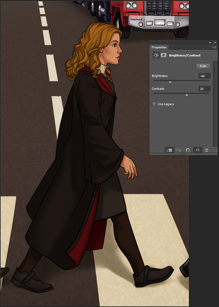
2. The first layer I add is a Brightness/Contrast Adjustment Layer. Click the icon in the red circle and choose Brightness/Contrast. Then make this layer into a clipping mask to it only affects the flat colors layer under it. Adjust your desired brightness and contrast according to the lighting in the scene. Now fill up the mask with black to start with a clear slate, and with a white brush start “painting shadows”. Different brushes will give a different look – softer or harder shadow edges, or a completely different brush shape like in the trees.

Geek Road - coloring process 2: darks

Masks can be confusing at first, but work with them a little and you’ll get the hang of it. You can see the black/white distribution in the mask’s thumbnail: the adjustments are visible in the white areas and invisible in the black.

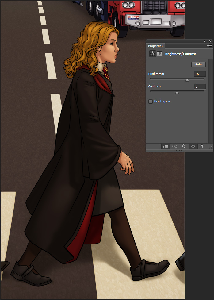
3. Next layer is similar, except this time I made it brighter and used it for highlights. The process is the same.

Geek Road - coloring process 3: lights

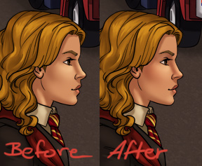
4. This method is quick, but it can make the colors look lifeless, since it’s just one hue getting lighter or darker. After the shading is there, in a new layer I add some more hues where necessary. Hermione here got some reds in her nose, cheeks and hands, with soft touches of color in a layer set to Multiply.

Geek Road - coloring process 4: hues

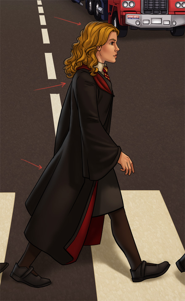
5. Finally, to connect the character to the scene and give her a 3D feel, I add some environmental light in a layer with low opacity. Here the main lighting on the character comes from in front of them, so I added some back light in sky-blue.
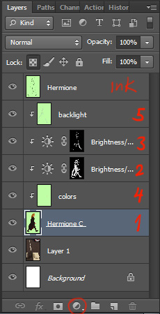
Geek Road - coloring process 5: backlight

You can add more and more Adjustment Layers with different hues for shading, more highlights, reflections etc, but since this illustration has so many details, I felt it was rich enough as it is. As I mentioned, the cool thing with this method is the freedom to change each and every layer without affecting the rest: for example changing Hermione’s robe color with a simple color fill, while the shading above it remains untouched. For your convenience, you can click here to download a PSD of Hermione with all the layers. It’s probably easier to understand when you see it before you.

Here’s the poster after coloring, with a few more Adjustment Layers for separate planes and for the whole scene, to tie it all together (Color Balance is awesome, give it a try).

Geek Road - colored

05 – Fixes

After a test print, we found some color issues (the Batmobile, for instance, was too dark and lost much of its detail). While making corrections we also added a few more small elements that I initially missed (like the writing on the Tardis or the beetle’s headlight) or that Idan and Danielle just came up with (I can list them, but wouldn’t it be fun to spot the differences yourselves?).

Here’s the final again:

Geek Road - Final

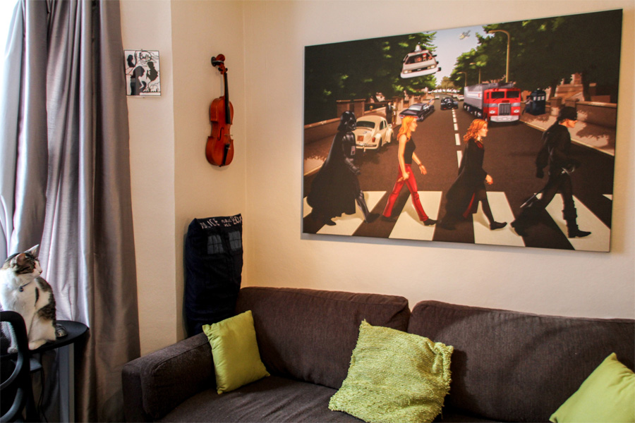
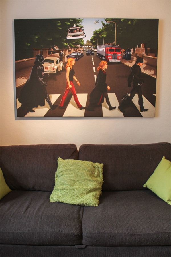
And here it is hung majestically in their cool geeky London apartment:

Geek Road - on the wall Geek Road - on the wall 2

Got questions about the process? Curious about an element in the poster? Who’ll win in a fight, Buffy or the Man in Black? Leave your comments below!
Aviv

Share