Archive for the ‘Work’ Category

Cutlasses without Captains

Monday, September 25th, 2017

Another Richard commission! My third project for Richard should have been a cover for a game that already had some character design done by someone else. It still sounded like a fun project, but then Richard said “actually, let’s do an illustration for a pirate game instead”, and I was ON BOARD and (wo)manning the cannons.

As usual, Richard provided wonderfully detailed specs and references, which led to this not-quite-rough sketch.
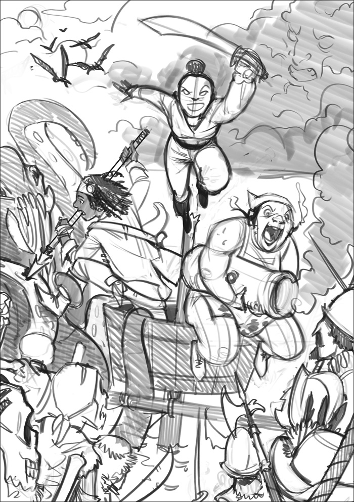
Cutlasses Sketch

After some notes, we were happy with this:
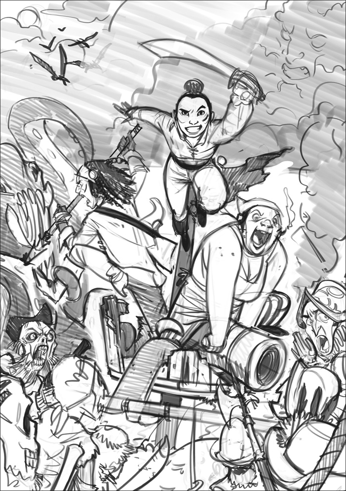
Cutlasses Sketch

And I moved one to cleaning the lineart and fine-tuning the details. The greys here are just to separate the different planes of the drawing for easy (albeit super dark for some reason) viewing before colour.
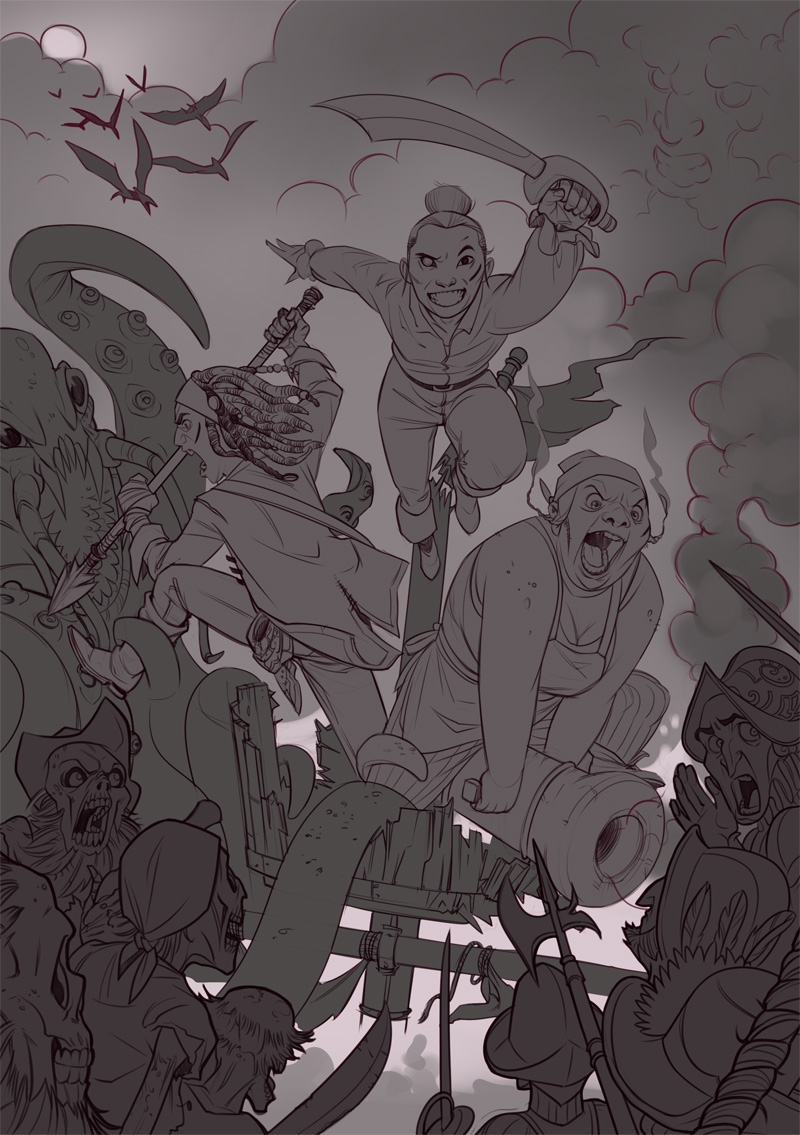
Cutlasses lineart

For laying down colour, I used the layers that had I already separated as base, and added the different colours as clipping masks – meaning that whatever I painted on them would only show within the bounds of the base layer. Here’s what it looks like:
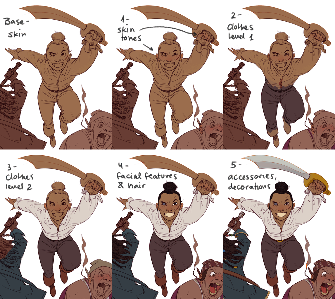
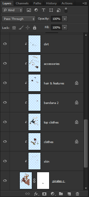
This is more or less what it looks like after this stage (although the background has already been treated here):
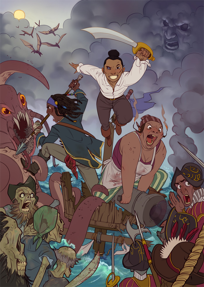
Cutlasses flat colour

The next step is light and shadow, which I add either with Adjustment Layers (Levels, Curves, or any other mysterious tone-adjusting controls I happen to stumble upon) or Solid Colour layers set to Multiply for shadow and Overlay for light. These special layers are also clipped to the base layer, on top of all the different colours.
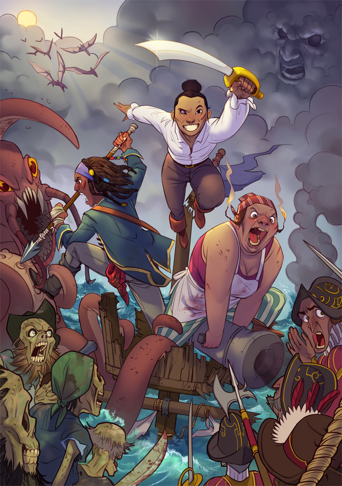
Cutlasses colour

And this is the point where I usually stare at the piece and wonder why I don’t like it. Often it’s because I’ve been working on it for hours and have lost all sense of judgement, but sometimes some adjustments to colour and contrast and a few small details can make the illustration pop a little more. I wish I was better at this stage, of knowing what needs to be done to make it GOOD, and when is it okay to say enough.

Here’s the final piece, which Richard was happy with. And so am I! It feels piratey. Richard posts updates about Cutlasses without Captains here, check it out.
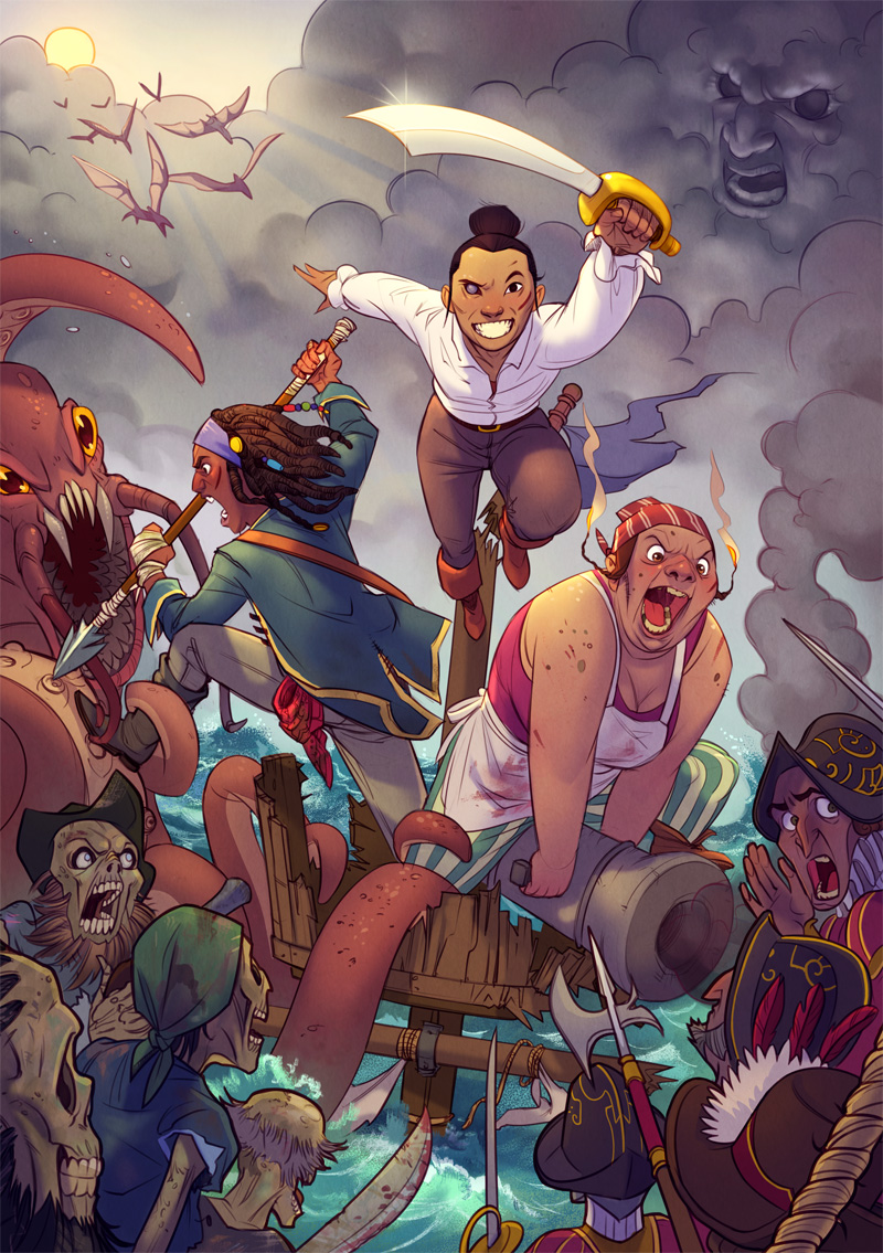
Cutlasses without Captains

Share

Teen Detective

Wednesday, July 26th, 2017

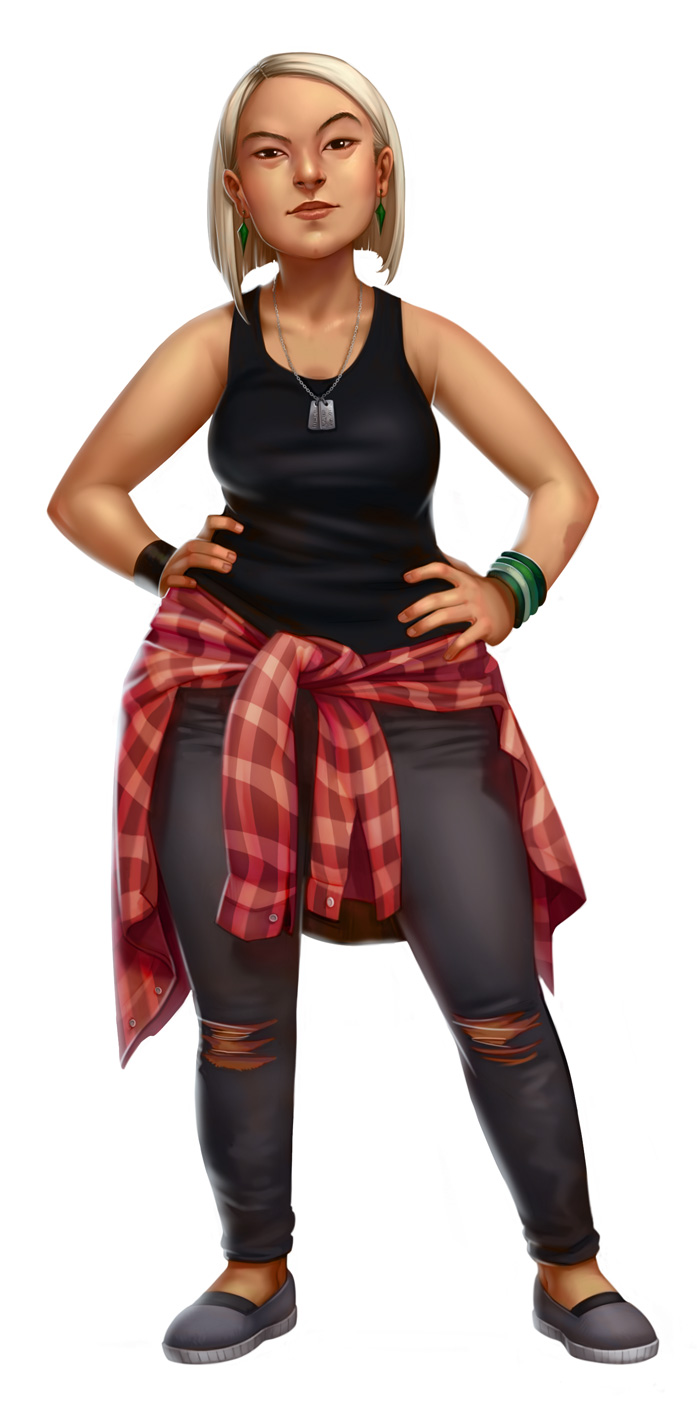
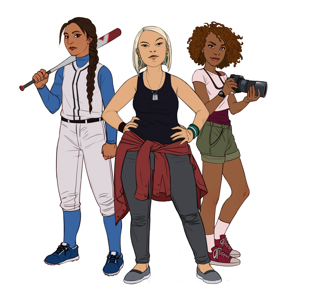
Here’s another commission from Richard Williams, this time for his Veronica Mars inspired C’thulhu Dark hack “Teen Detective”, which you can read about as it progresses here. He requested an illustration of three teenage girl detectives of varying ethnicities, body types and personalities, in a composition with one main lady in the front and two supporters to her sides. The style he was after was like my Bad Bones Lawrence character design.

Tip for commissioning artwork: adding a reference image that shows the style you’re looking for – lines, colour, cartoon/realism, flat/3D, level of detail – is really helpful. It means the artist knows what they’re aiming for, and the client knows they’ll get a result close to what’s in their mind’s eye. Picking a reference image out of the artist’s portfolio is even better, because it shows that a) you’ve looked at the artist’s body of work and chose them specifically; and b) the artist has worked in that style in the past, so it’s in their creative “arsenal”.

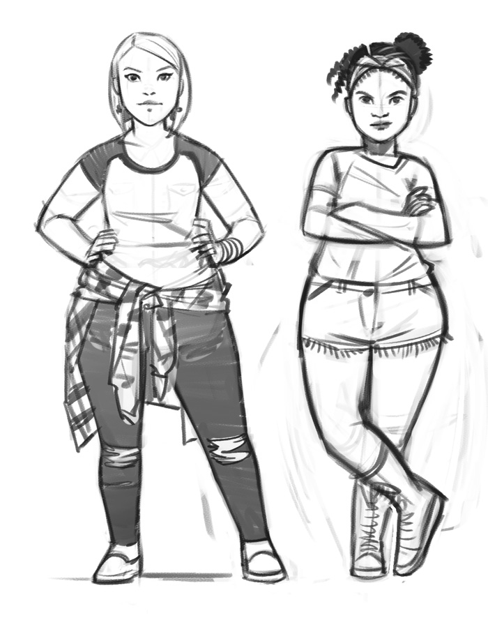
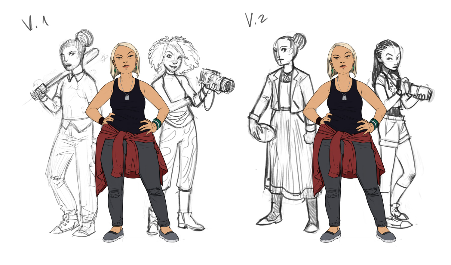
Richard also wanted each character as a separate image, so we started with Main Girl (naming not being our strong suit at this point). First I sent Richard two options for her design and pose:
Teen Detective: Main - concepts

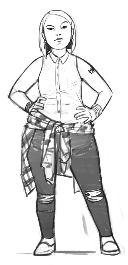
He picked the left one, and asked that I make her convey “the cynicism of the private eye, the sense that she can read your guilt on your face, and her status as an outsider”, as well as give her sliiiightly more asian features to make her look more mixed race.
Teen Detective: Main - sketch

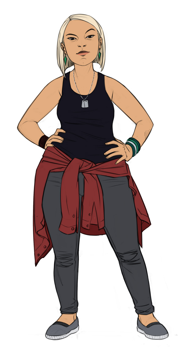
After a couple more adjustment to her outfit, I sent a rough colour version to make sure we’re on the same page before I move on to the long process of painting.
Teen Detective: Main - rough colour

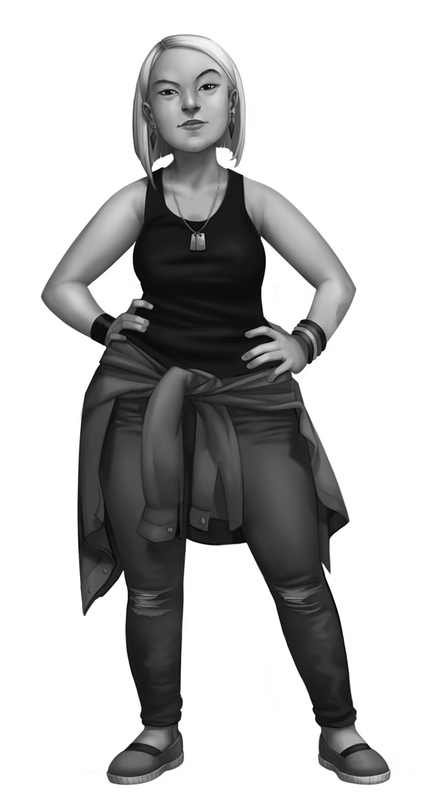
Colour doesn’t come naturally to me, so I prefer to start rendering in black and white to get the tones and shapes right, and only then apply colour. Here’s the black and white version, which I also sent to Richard to make sure I didn’t veer off the original sketch too much, which can often happen with painting.
Teen Detective: Main - black and white

And lastly, the final colour render, with all the details and patterns and stuff.
Teen Detective: Main - final colour

It was a good call to go through the whole process with just one girl first, because after looking at everything, Richard found the rough colour version appealing in its cleanliness and simplicity, and asked for the other two girls to be in that style. If needed, we could always pick up from that point and go the full painting route in the future.

So for the other two girls (named “Snoop” and “Tough” for work process purposes) we went through the same steps, starting with two quick options each.
Teen Detective: Girls - concepts

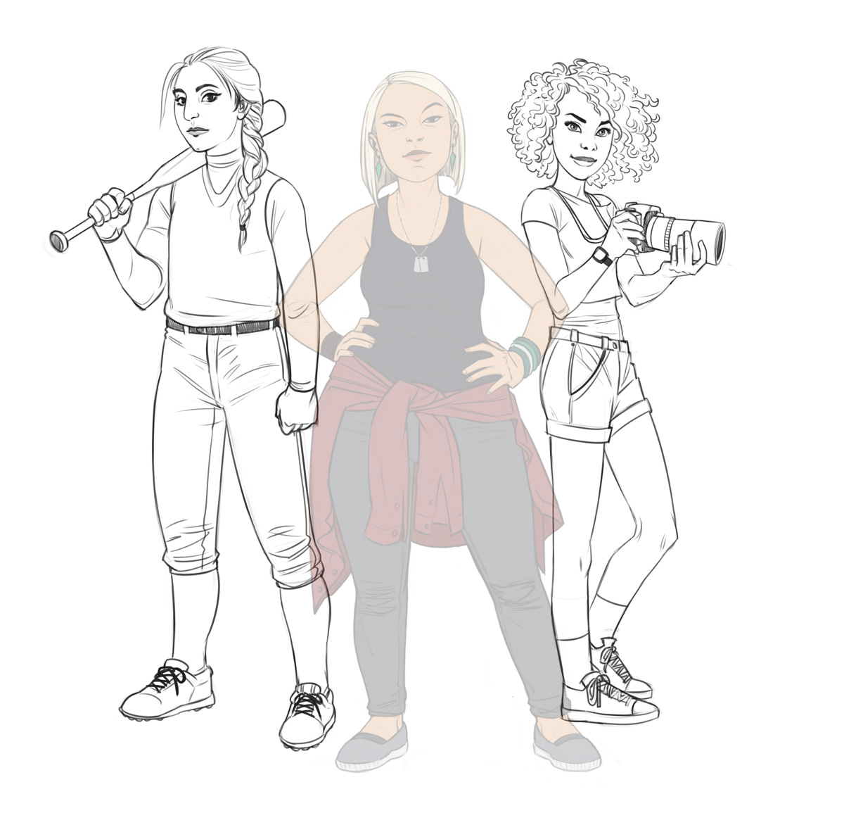
A little mix-and-match and some outfit comments later, here’s the clean pencil artwork for the two girls:
Teen Detective: Girls - pencil

And finally, the finished illustration in flat colour:
Teen Detective: Girls - colour

You can see Richard’s progress in the game’s Google Plus collection page. I’m looking forward to being a cool teenage detective when the game is fleshed out!

Aviv

Share

Space party, table of seven!

Wednesday, July 12th, 2017

I was recently commissioned by James, an Edge of the Empire GM, to draw his campaign’s party. He runs a game for his two friends and their five children, which is so cool. How does the saying go, a family that harnesses the light side together, stays together?

He sent me descriptions of all of their characters, along with helpful links (because I warned him in advance my Star Wars knowledge is limited to what I’ve learned from the Bacta Basics segments on the Campaign podcast), and we agreed on a police lineup type poster, because they’re a bunch of scoundrels (and I’ve literally *just now* learned that Timothy Zahn’s book “Scoundrels” features the same image style on its cover. So…force-sensitive minds think alike, I guess?).

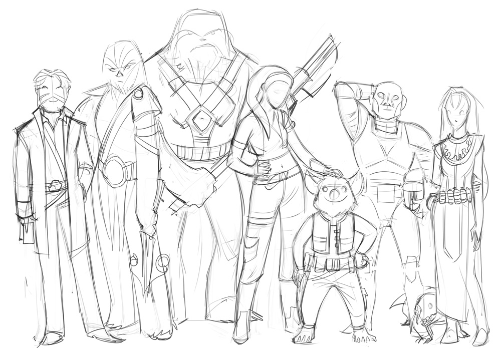
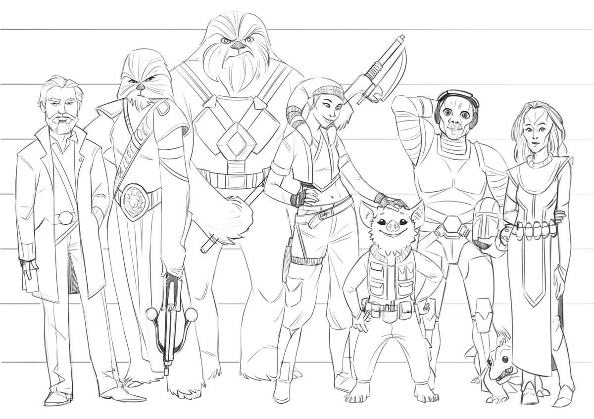
Here’s the layout I created to make sure I got the body shapes, heights and poses right, and – following James’s approval, the clean sketch.

Edge of the Empire party: layout sketch

Edge of the Empire party: pencil

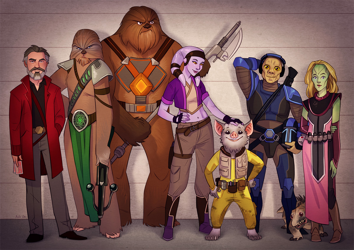
For colour, James mentioned his friends’ family had a system where each member has their own colour for stuff – water bottles, backpacks etc – so they know what belongs to whom (apparently that’s helpful in a family of seven people). I loved that idea – both for real life and for the poster – and tried to incorporate each person’s colour in a clear, but subtle enough way.

This is what we ended up with, which I hope the party likes! You can read their adventures on their Obsidian Portal adventure log: http://deathfrombelow.obsidianportal.com/adventure-log

Edge of the Empire party: colour

May the Force be forever in your favour!

Aviv

Share

A Town with Pep

Friday, June 23rd, 2017

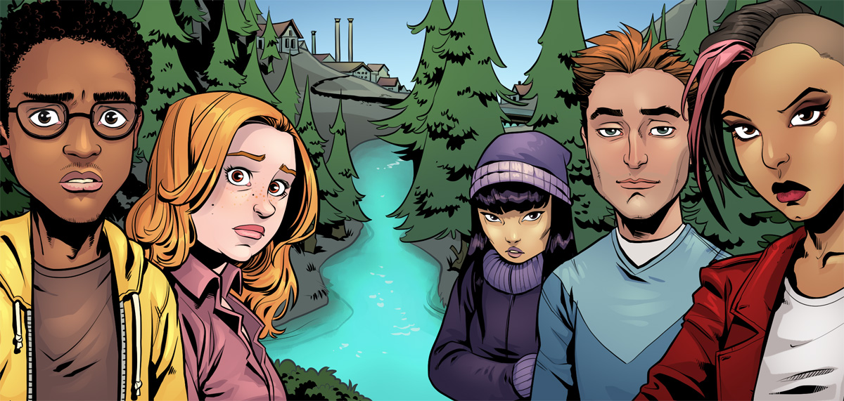
I finished the illustration for A Town with Pep – the Riverdale-esque game by Richard Williams – that I showed a process for a few weeks ago. Below are the ink and finished colour stages.

A Town with Pep - ink A Town with Pep - colour

Did you spot the difference (other than, well, one being in full-colour)? After seeing the finished piece, Richard mentioned that for a title illustration for a game called “A Town with Pep”, there’s very little “town” in the artwork. Luckily we found just the right spot to quickly build a little settlement, complete with a small factory that I borrowed from one of the early background references Richard provided. There’s always some pep happening around a factory.

Share

Objectifying Characters

Wednesday, May 24th, 2017

Much has changed in the year+ since the last post. Well, not MUCH, but one big thing: I’m now a full-time freelance illustrator! My website got a small renovation, which this blog and my Facebook Page should probably share at some point, but if I waited with updates until that was done, well, it might have been another year before the next post.

The reason I decided to become self-employed is that – while I really enjoyed working on Viber sticker packs and being part of that awesome team – I wanted to branch out and do some different things as well. After a little more than a month “on the job”, I can happily say that I’m doing just that.

One project I recently started is an illustration for “A Town with Pep“, an indie RPG from Richard Williams. It’s the first in several projects Richard commissioned, which is great because a) they’re all different and interesting, each in its own way; b) Richard is a client who knows what he wants, knows how to convey that, and still leaves a lot of the creative “reins” in my hands and c) he’s totally cool with me sharing my work in progress. Which is what’s happening now.

A Town with Pep

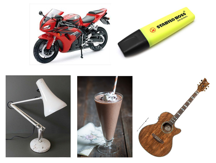
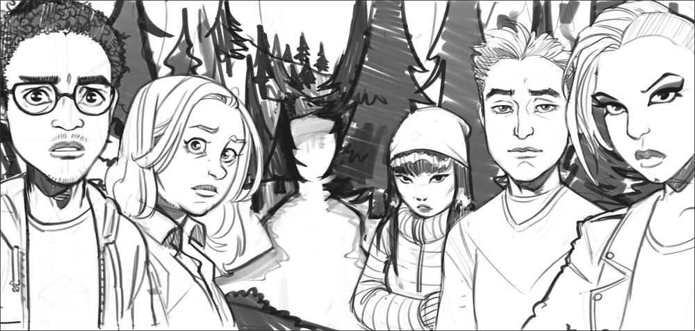
“A Town with Pep” is a “Teen mystery drama in small-town America”. Think Riverdale in RPG form. Richard commissioned a title illustration featuring 5 teenagers – examples of the characters one might play – and he gave me complete freedom in designing them. But, since complete freedom paralyses me artistically, I asked him to give me some character design “seeds” in the same way a player would start creating a character in the game: picking an object that symbolises the character. Richard sent me these five images of everyday objects. As a little exercise, see what kinds of characters come to your mind before reading on to see my interpretations.

A Town with Pep - Objects

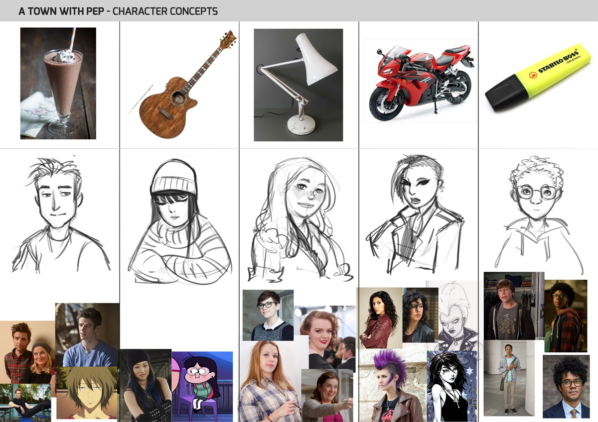
Looking at the objects, I started getting ideas for some of them, and collected references that came to mind from various media (mainly TV). I often do that when coming up with characters for roleplaying games as well, probably because I watch ALL the television and that’s just what my mental library is composed of. After getting a more or less solid idea of each character I drew a quick sketch for each. Are they anything like what you imagine when looking at the objects?

A Town with Pep - character concepts

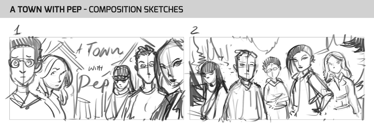
The next step was tackling the composition of the image. Richard gave me a good reference shot (from Riverdale actually), and I tried two takes on it:

A Town with Pep - composition sketches

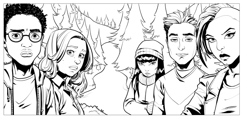
#1 was approved, and I moved on to pencilling the scene. During feedback on the first draft, Richard got the idea of showing a “missing” sixth teenager made up of negative space. I like it because it makes the composition more interesting, as well as playing into the sense of mystery this game is all about. Here’s the approved pencil stage.

A Town with Pep - pencils

That’s where we got to so far. Work in progress, whoo!

Aviv

Share

Merry Christmas!

Friday, December 25th, 2015

It’s customary to upload all holiday-related content before the actual day of Christmas, but this is a whole day when no one works, everything is shut down, and the chance of rain is too high to risk going out for a walk (also, that would involve getting up and going out for a walk), so what better time to compile some recent artwork into a festive blog post?

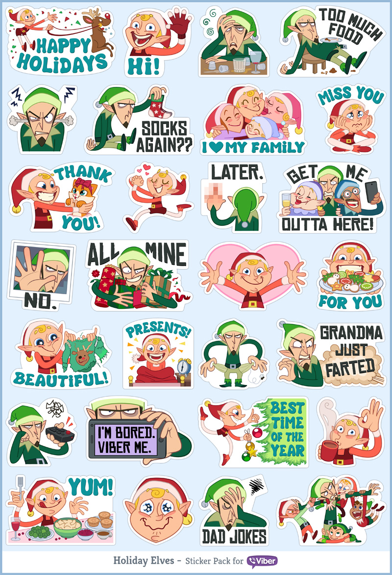
So first with the Christmas-y stuff: this is a pack I designed and was released for free on Viber as a holiday gift to our users (you can download it now if you have Viber). The idea was to steer away from the usual sugary, kitsch Christmas stickers, and show both sides of the holiday: the annoyingly enthusiastic and the bitterly cynical. I don’t even really celebrate Christmas, but having had my fair share of family dinners, long holidays and festive atmospheres, I could absolutely relate to both.

Viber sticker pack: Christmas Elves

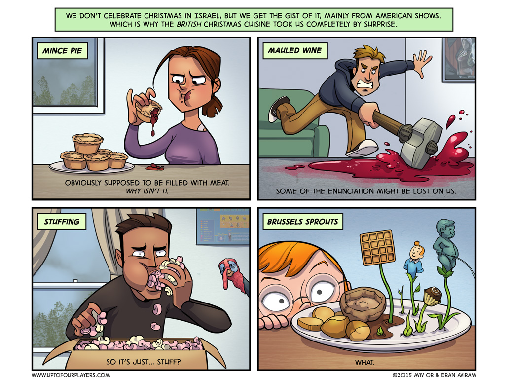
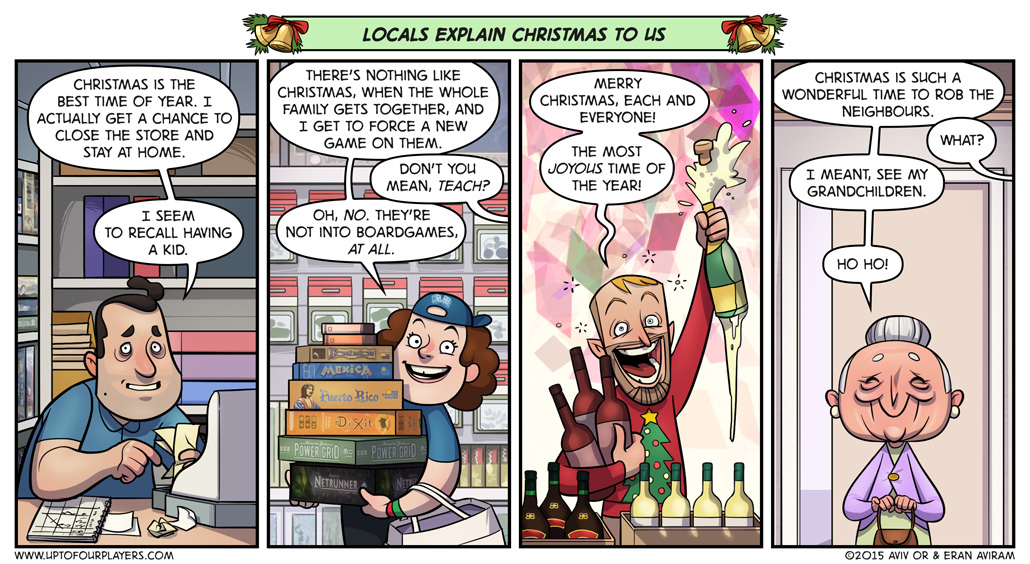
Speaking of festive atmospheres, our two recent posts in Up to Four Players are all about Christmas, from the (quite autobiographical) point of view of foreigners coming into this strange wonderland. I’ve spent three Christmasses here, and I’m still discovering new things; for example, how many times a person can hear the same Christmas song before losing their mind. (Clicking the thumbnails will take you to the full-size strips in Up to Four Players.)

Up to Four Players #50: The Meaning of Christmas Up to Four Players #51: Festive Perspectives

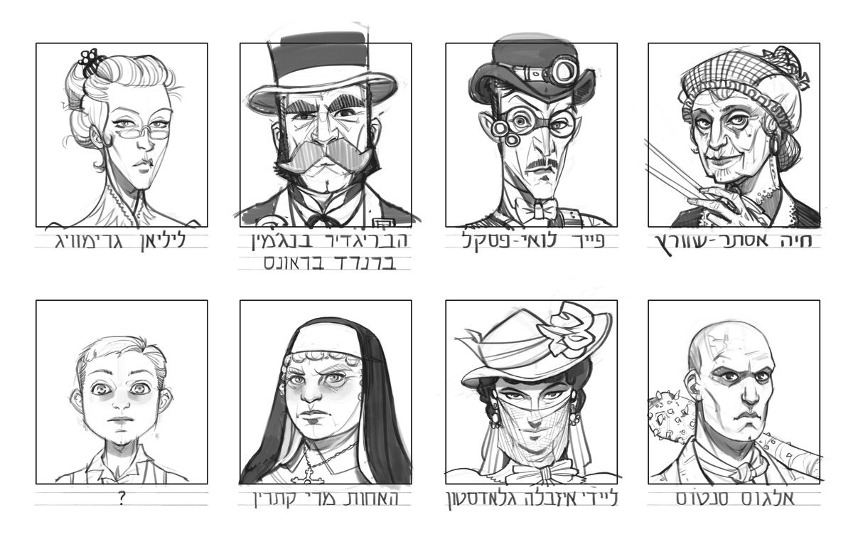
Speaking of players, next Saturday will join several of them, in a 12-hour-long roleplaying marathon for charity. It’s in Hebrew, so if you’re into that sort of language, do check it out. Eran will be running a victorian monster-hunting adventure in the Savage Worlds system, with 3 brave heroes who’ll stick by him throughout the day, and several guest players who’ll pop by for a spell (me included!). I drew portraits of all our characters.
Rippers character portraits

Speaking of guest-appearances, I made one in Leigh Lahav’s recent video about Star Wars’ rising star, BB-8 the robot. I also helped her design some of the characters, but I’m much more excited about my small voice-acting role. See if you can guess which one it is.

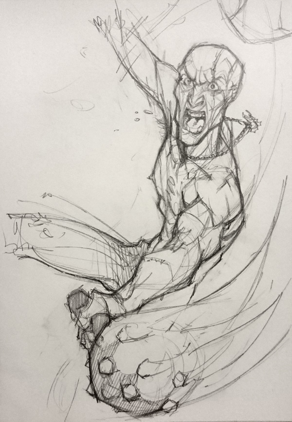
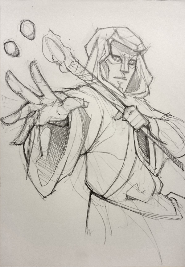
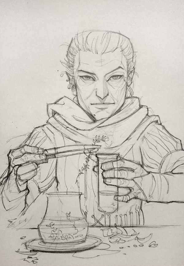
Speaking of…umm…roles, I recently sketched the characters from our ongoing roleplaying campaign in the Warhammer Fantasy Roleplaying system. These are, in order: Evyatar’s character Brioche, the slightly crazy religious fanatic; Dassi’s character Marion, the slightly mysterious gold order wizard; and my character Agnes, the slightly criminal apothecary.

Warhammer: Brioche Warhammer: Marion Warhammer: Agnes

I think these are all the segues I can come up with this morning. Have yourselves any kind of very merry holiday that you’re prone to celebrating this time of year, and if perchance I fail to write my “End of 2015” post before the end of 2015, a very happy new year!

Aviv

Share